17 Green Paint Colors for Every Room in Your Home, From Soothing Sage to Electric Emerald

There’s a reason green is a trending color right now. Many of its various shades are inherently calming, putting anyone who steps through your front door immediately at ease. In fact, from moody emerald in a library to soothing olive in a bedroom, this magical color family works in almost any space. It can be serious, elegant, or cheerful; it can add mystery, or it can connect a room to nature. In other words, green does it all.
Here, we spoke to interior designers about their favorite green paint colors that they absolutely love. Follow these expert-approved tips and tricks, and you’ll have a beautiful, tranquil home in no time.
Olive Grove by Sydney Harbour Paint Company
Cloth & Kind / Marta Xochilt Perez
Wrap a room in green, and you’ll create a serene, nature-inspired retreat—even if it’s a slightly darker, moodier hue. “We designed this library to be a calming and restorative space where our client could unwind at the end of a long day,” says Krista Nye Nicholas, co-principal of Cloth & Kind. “We opted for Olive Grove for the walls to evoke a sense of balance, renewal, and harmony.”
Tavern Charcoal by Benjamin Moore
Stein Studio / Laurey Glenn
A dark green could be mistaken for black depending on the light, but that’s what gives it an elegant, rich feel—especially when paired with warm brass and wood finishes.
“Tavern Charcoal is a beautifully saturated green that channels the sophisticated richness of a hunter green Range Rover,” says Ellie Stein, owner of Stein Studio. “It’s bold enough to command attention, yet grounded in humble confidence.”
Coastal Plain by Sherwin-Williams
The MD Design Co / Sierra Ann Photography
A cool green can instantly transport you to a beautiful spring day in the forest. It’s the ultimate calming color. “Our entire office is bathed in Coastal Plain because I wanted a color that evoked confidence and soothed the mind—this was the perfect fit,” says Marcella Domonkos, owner of The MD Design Co.
She notes that it pairs beautifully with brass finishes and natural textures like rattan, cane, wicker, and marble.
Cooking Apple Green by Farrow & Ball
Vicki Kelly Decor / Tori Sikkema Photography
When Vicki Kelly Gindi, principal at Vicki Kelly Decor, was looking for a color that would feel like a natural extension of the outdoors, she landed on Cooking Apple Green.
“As the light shifts throughout the day, it consistently feels fresh and calming,” she says. “True to its name, it brings a warmth and coziness to the room—the kind that makes you want to linger over coffee just a little bit longer.”
Sussex Green by Benjamin Moore
Forge & Bow / Arris Photography
The warm, dramatic tones of Sussex Green are just right in a moody bedroom, like this one designed by Forge & Bow. It adds a mysterious, cozy look to a space— particularly when paired with warm wood tones.
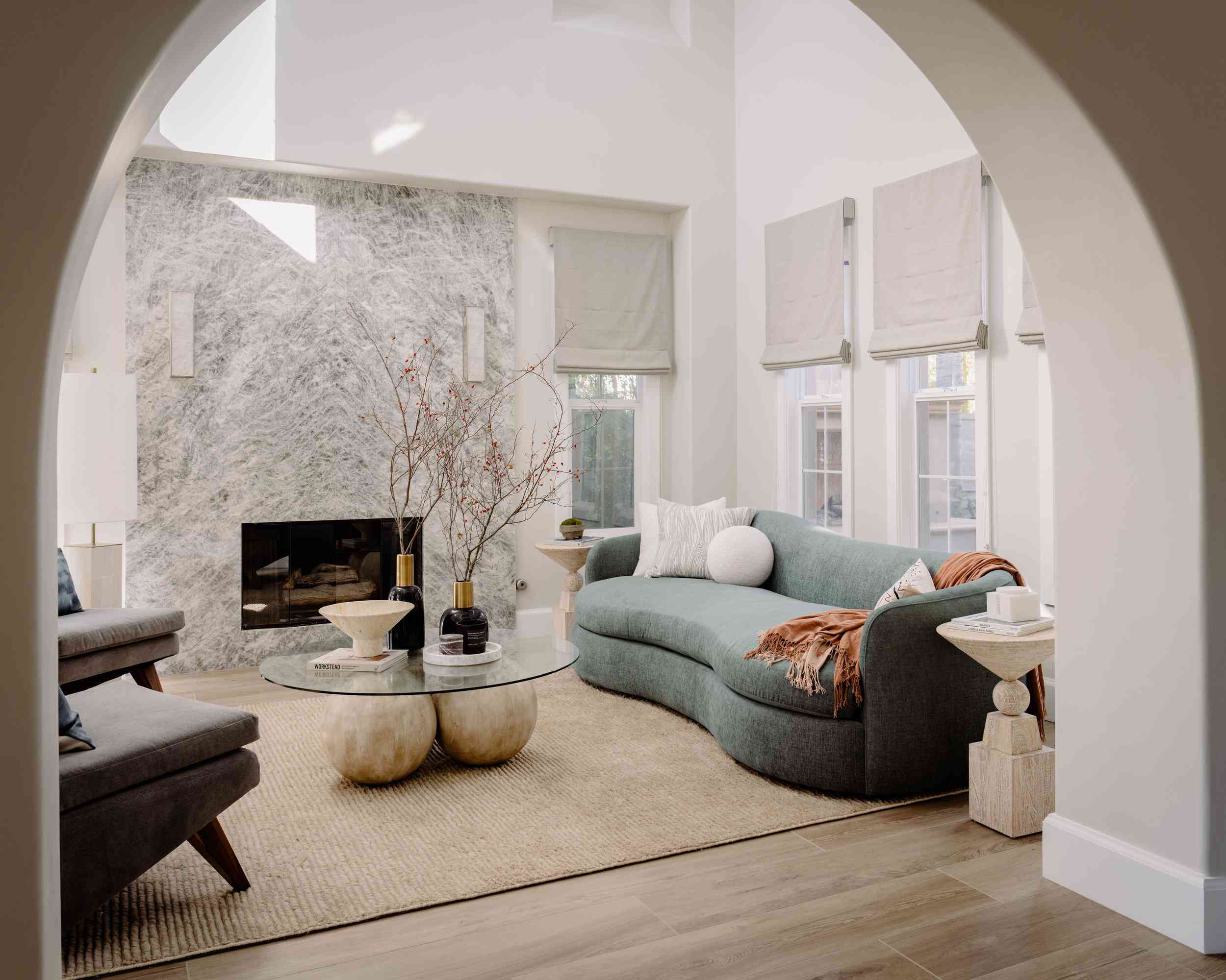
Austere Gray by Sherwin-Williams
Elle Du Monde / March Mauldin
Gray and green are a perfect match—especially when they’re mixed together to create an airy neutral. This living space from interior designer Elle Du Monde feels serene thanks to Austere Gray, a cool-toned light green that graces the walls.
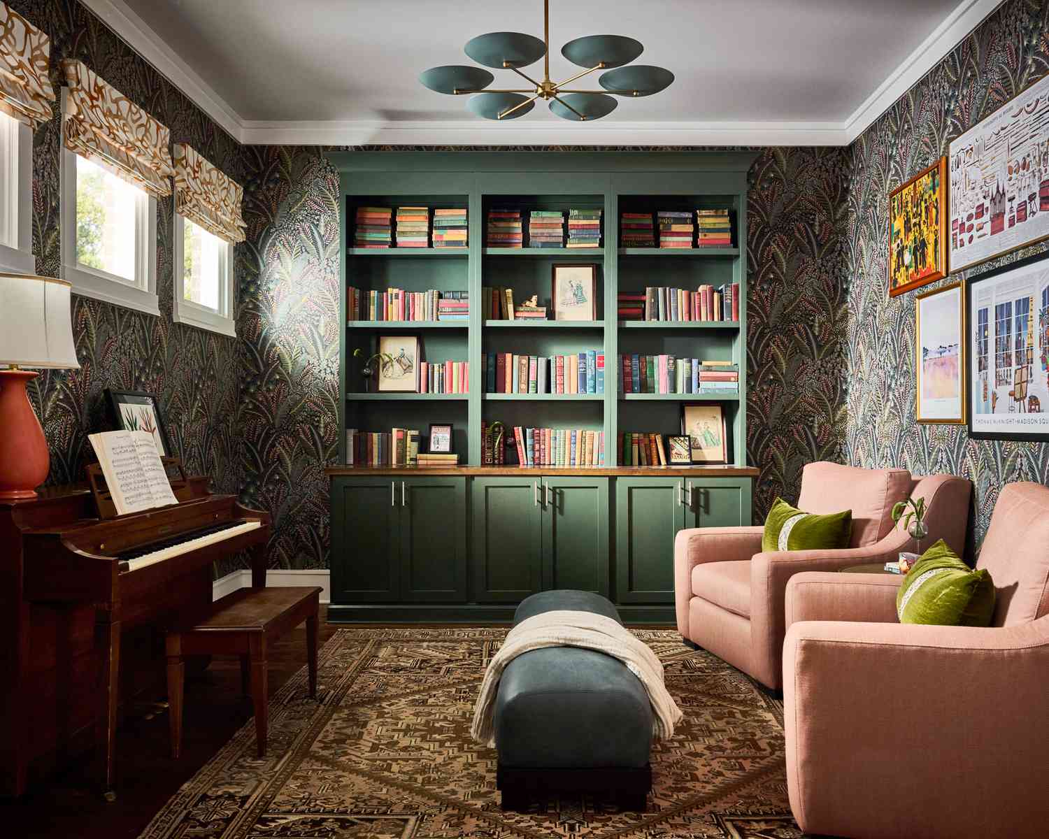
Laurel Woods by Sherwin-Williams
Elle Du Monde / March Mauldin
A dark green library is always a good idea—particularly when it’s a shade like Laurel Woods. This dark, moody, hunter green-inspired hue feels like what you’d find on the forest floor after a rainstorm. It’s lush and alive.
Avocado by Benjamin Moore
Morgan Madison Design / Stephen Karlisch
Tanner Morgan, partner and designer at Morgan Madison Design, took a cue from his client’s first car, an Oldsmobile, when he chose Avocado for this kitchen.
“We love this unexpected retro hue when it’s given a modern refresh,” he says. “When bolstered with a high lacquer finish and played off darker forest greens, marine blue-greens, and lemony yellows, it helps create a painterly and saturated environment.”
Kennebunkport Green by Benjamin Moore
CWG Design / Baxter Miller
When you need to channel a sense of calm in a room where productivity reigns, look to a light, nature-inspired green. Cate Gutter, owner and principal designer of CWG Design, went for Kennebunkport Green for this particular space. “It has a serene, grounded vibe,” she says. “It’s perfect for a home office, where my client spends a lot of time on Zoom.”
Opaline by Sherwin-Williams
Kathleen Reynolds Interiors / Lacey Sombar
Just a hint of green can be enough to make a room sing, especially when there are other elements at play. Here, the subtle Opaline adds just a hint of color and ties the whole room together. “It has just a touch of green, which makes it great for larger spaces,” says Kathleen Reynolds, owner of Kathleen Reynolds Interiors.
Pewter Green by Sherwin-Williams
Wendy Smit Interiors / Allison Elefante.
A color-drenched green is always a good idea when you’re looking for a cozy retreat, and Pewter is the perfect choice. “Green can be particularly soothing with the right undertone, so we love to use it in bedrooms,” says Wendy Smit, founder and principal designer of Wendy Smit Interiors. “We recommend pulling the color around the room in throw pillows and finding a rug with some subtle pops of green.”
Pigeon by Farrow & Ball
Wendy Smit Interiors / Allison Elefante
Sage is one of those colors that feels instantly soothing, whether it’s in a bedroom, office, or kitchen. “Our favorite lighter sage is Pigeon by Farrow & Ball,” says Smit. “It’s a perfect soft green that’s so good, you could almost consider it a neutral.”
Ripe Olive by Sherwin-Williams
Wendy Smit Interiors / Allison Elefante
When it comes to green, don’t be afraid to go dark, even in a kid’s room! Ripe Olive is a great selection because it’s saturated without being serious. “It has a warm and muddy undertone that makes it a color with staying power,” says Smit. “Colors that are too crisp or bright will date themselves in a few short years.”
October Mist by Benjamin Moore
Melanie Bryant Interiors / Followell Fotography,
For a welcoming cottage kitchen that has a touch of color, a light green like October Mist strikes just the right tone. “This earthy sage created the perfect backdrop of color while keeping the kitchen somewhat neutral,” says Melanie Bryant, founder of Melanie Bryant Interiors.
Rye Grass by Sherwin-Williams
Simply Southern Cottage / Hector Sanchez
“Being in Louisiana, green helped me bring one of the main colors of the bayou into the interior of my home,” says Sara McDaniel, designer and owner of Simply Southern Cottage. She opted for the bright, yellow-green Rye Grass hue for her kitchen cabinets. “It adds a whimsical, timeless charm to the space while also adding depth, character, and a color representative of the great outdoors,” she says.
Olive Grove by Sherwin-Williams
Studio Burgoon / Lindsay Brown
Red and green might seem like a holiday-only combination, but when you have the loveliest, most subdued shade of olive, it reads like something plucked straight out of a historic home. For this charming bedroom, Studio Burgoon paired Olive Grove with red tones to achieve this effect.
Greenwich Village Green by Benjamin Moore
Andrea Sinkin Design / Lo Austin Photo
A soothing hue, like Greenwich Village Green, can create the prettiest backdrop for a mudroom. It’s a calming respite, whether you’re headed in or out.
“This beautiful soft sage has very subtle undertones and works beautifully with a warmer palette,” says Andrea Sinkin Jaffe, owner of Andrea Sinkin Design. “We were able to pull this color into the house through textiles in other spaces as well. It’s the perfect shade of green—very soft and pleasant.”