3 Outdated Couch Colors That Are Aging Your Living Room
Key Takeaways
- Picking a couch is a balance between classic and fresh to avoid it feeling outdated too soon.
- Jewel-toned velvets and pastel sage green are being replaced by muted, earthy shades like olive and rustic copper.
- Cool-toned gray is losing popularity as warmer, richer neutrals become more desirable.
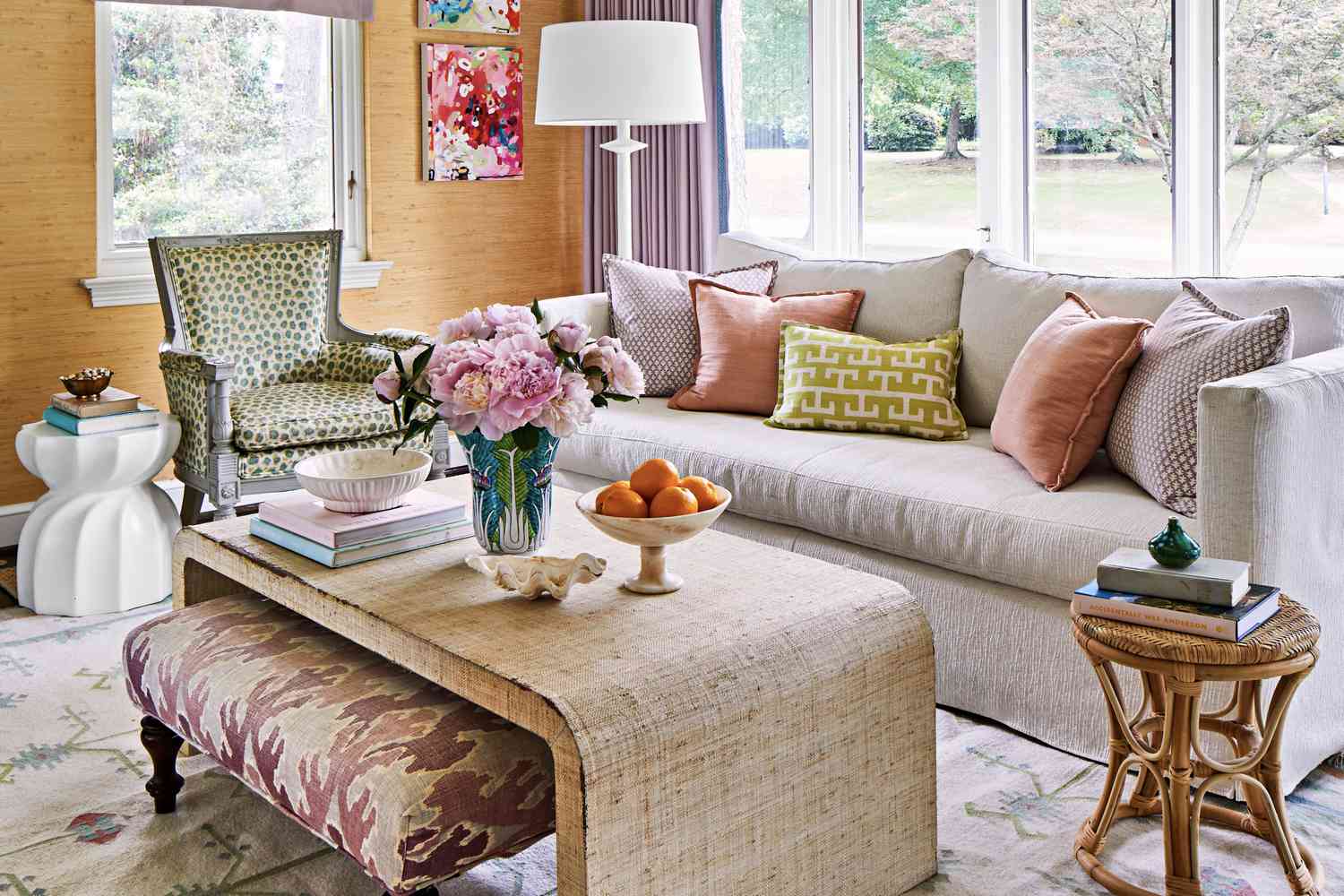
Chances are, your couch is the biggest piece of furniture in your living room—and it might even be the most expensive. Picking one out, Alexis Earman, founder of The Woodbury Home in Wilmington, North Carolina, says, is always a bit of a balancing act. “You want something classic, but not boring, fresh, but not trendy to the point of feeling dated in a few years,” she says. “Color tends to be the hardest part of the decision.”
While each one has its place, there are a few that just don’t have the same staying power anymore. When you think about the size of a couch, it makes sense that they’re quick to date your space. According to designers, these are the ones clients are replacing and avoiding right now.
Jewel-Toned Velvets
In the late 2010s, emerald, royal blue, and amethyst velvets were the moment, but not anymore. “These ultra-saturated colors feel overbearing in 2025,” insists Cheynne Ely, owner and principal designer of Cheyenne Paige Interiors in The Woodlands, Texas. “Muted, moody colors like olive, rustic copper, and soft plum offer a modern take on velvet.” Plus, all of them are rooted in nature, which helps invite the outdoors in and makes them decidedly timeless.
One of the perks of selecting a less-saturated hue is that it’s often more versatile. Even if your style changes over the years, you can rely on it to pair more seamlessly with your new decor. This means you can purchase a higher-quality couch that’s trend-forward without worrying about it becoming dated.
Cool-Toned Gray
Some people swear by it, but Earman isn’t one of those people. “Gray couches can often feel a little cold and flat, missing the warmth and versatility that other shades bring to a space,” she explains. “They don’t mix as effortlessly with evolving color palettes the way softer off-whites or rich, earthy browns do.”
It’s not that gray can’t work, Earman adds. It’s just becoming trickier to make it feel fresh compared to the more natural, cozy hues that are taking center stage. If you’d like to make gray work in your space, consider a charcoal hue with depth to it, or a shade that has some blue to make it more of a chameleon.
Sage Green
Depending on who you ask, this one may be controversial, but Ely stands firm. “The muted, pastel-like sage of the early 2000s feels washed out compared to today’s deeper, earthier green tones,” she explains. For an updated take, she recommends opting for olive, forest, or mossy greens. No matter what form they come in, each mentioned shade pairs beautifully with marble, wood, and other living materials. These just so happen to be popular right now but are also enduring from both an aesthetic and quality standpoint.
Still swooning over sage? Pick a shade with less of the pastel Ely mentioned, instead opting for one that is deeper in tone and/or has a touch more warmth. You can accomplish the same look, but in a way that feels more modern (and probably shows less stains).


