
3 Times You Should Never Paint a Room Blue, According to a Designer — “Sometimes, It’s Harder to Work Around”

I have always been under the impression that blue goes with everything — blue jeans, a navy blue blazer, even classic blue-and-white bone china on any table setting. But — and I apologize in advance to all the blue fans reading this — I recently learned that when it comes to our homes, blue isn’t always best.
If you’re currently scheming blue room ideas or are trying to select the perfect shade for your living space, and you’re finding that something just feels off, the struggle might be because it’s simply not the right color for the space. Blue is calming, serene, and elegantly timeless, yes, but it’s not a neutral. (At least not always.)
So, when should we steer clear of decorating with blue in our interiors?
1. In Rooms You Regularly Redecorate
DO INSTEAD: The white paint color in this living room provides a timeless base that will pair well as the art and shelf decor may change
(Image credit: Matthew Williams)
“Avoid painting a room you will use often and likely want to change throughout the years. Blue is harder to work around,” says Georgina Wilson, Australian-based architect and founder of Georgina Wilson Associates.
In community-centered spaces, like living rooms, decor tends to change with the seasons — whether it is as simple as switching out your throw pillows, adding a couple of new picture frames, or even refreshing your rug. “Aim for a more neutral paint color that will pair well with art and different furniture over time,” says Georgina.
An off-white or beige backdrop will allow you to bring in pops of blue in things like bookshelf decor and flower arrangements — it’s the best of both worlds.

Georgina Wilson is an award-winning, registered, Australian-based architect with over 25 years of experience. Georgina has worked in both residential and commercial design and is now the founder and principal architect of Georgina Wilson Associates.
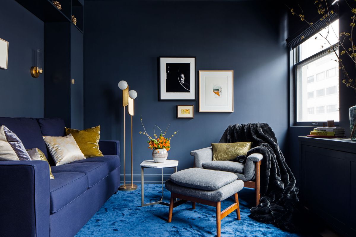
2. In Larger, More Common Spaces

DO INSTEAD: In larger, more common spaces, make impact by introducing color through your decor, rather than drenching the space in a baby blue hue.
(Image credit: Sharon Litchfield. Design: Brianna Hughes Interiors)
Blue tends not to work as well as a paint color idea in larger, more common spaces, says Georgina. “While it can be nice for a bedroom color idea, blue can sometimes feel a bit too ‘baby’,” she adds.
And while today’s interior design trends tells us that we’re all craving a bit more color and fun in our homes, there are other ways to do it. “If you feel like you need to paint a wall (or walls) a certain color just to jazz it up, you might actually need more significant changes,” says Georgina. Perhaps it is really your sofa that is out of place, or the color of your rug is throwing things off.
3. When You Want to Create a Feeling of Warmth

DO INSTEAD: Colors like terracotta, burnt orange, and butter yellow will ultimately bring a warmer feel to a room than blue.
(Image credit: Lick)
Blue is a cool color, and will never give your room that cozy warmth that browns, reds, or yellows will. If your goal is to create a cozy living room that glows with light and snugness, blue will never be the best way to go.
“Blue grays, while elegant, can feel stark in interiors, sometimes lacking warmth and depth,” says Georgina. A soft, light blue or rich navy might bring a level of serenity and peacefulness to the space, but the lack of warmth in the undertones of blue will always cause it to lack that certain enveloping feel that warmer colors bring.
If warmth is what you are seeking, choosing cozy paint colors like mustard, terracotta, and browns are the better way to go.
In saying all that, if you really are set on painting your walls blue, there are, of course, ways to make it work. “I think blue always works if you put the effort in,” says Livingetc’s color expert Amy Moorea Wong. “There are seemingly endless shades of color out there, which all vary wildly in their personality, undertones, how they react to certain types of light, and which other colors go with blue.”
So, while it may not be the easiest color to work with, if you really want to do it, do it. “It’ll probably just take a lot of samples, testing, and letting go of the fixed color you had in your mind of what you wanted to use,” recommends Amy.