6 Exterior Paint Colors That Are Secretly Annoying Your Neighbors

Key Takeaways
- Stark white, cold gray, and pastels can make a home feel sterile, lifeless, or out of place.
- Unnatural shades and excessive color blocking can clash with the surroundings and feel jarring.
- Copying a neighbor’s color or choosing overly bold shades can disrupt the neighborhood’s aesthetic.
Whether you live somewhere big or small, painting the outside of your home is a major commitment. You have to look at the color—on an unavoidably large surface, no less—every single day, and so do your neighbors. Though you should always pick the hue that speaks to you, it’d be naive to assume that people around you (and potential buyers) don’t have opinions. These are the paint colors your neighbors are hoping you avoid, according to interior designers.
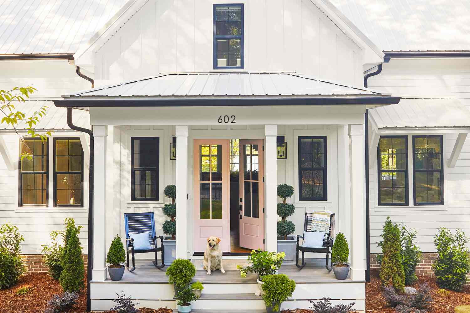
Stark White
“White homes have traditionally been considered timeless, but with the current popularity of painting homes all white, it can be problematic,” says Debbie Mathews LeRoy, founder and principal designer of Debbie Mathews Antiques & Designs in Nashville, Tennessee. She attributes this to two things: First, a stark white paint color can feel sterile and even blinding in natural sunlight. It can also lack the depth needed to showcase the beautiful architectural details of a home. “Instead of white, I prefer a creamier white that’s softer in color, not a stark contrast to the landscaping surrounding it, and able to hide dirt better,” she finishes.
Cold Gray
Gray used to be the “it” neutral, but that title is no longer. “In real life, it can make a home look flat, lifeless, and a little sad,” explains Cheynne Ely, owner and principal designer of Cheyenne Paige Interiors in The Woodlands, Texas. Pair it with a bright white trim, and suddenly, your house looks like an unfinished concrete slab.” Instead, she recommends opting for a warmer gray with earthy undertones—think soft greige, warm taupe, or even a deep charcoal. It’ll still feel modern but with way more depth and curb appeal.
Pastels
A light robin’s egg blue or pale mint can look charming in coastal towns or on a Victorian with all the right trim details, those are the exceptions rather than the rules. “In more traditional neighborhoods, they start to feel less ‘classic’ and more ‘Easter,’” Ely advises. If you can’t resist a hint of color, she encourages you to go for a soft French blue or even a dusty blush—“just something that doesn’t make your house look like it’s part of a springtime parade.”
Your Neighbor’s Color
Jamie Gernert, founder of WYC Designs in Winter Park, Florida, says one of her biggest exterior pet peeves is “picking out the perfect color and then having someone copy it.” A lot of time and money is invested in ensuring your home makes a first impression that represents the style and personality of those living inside it, and having a duplicate on the street makes the neighborhood feel more cookie-cutter.
Unnatural Shades
Mathews LeRoy generally recommends selecting an exterior paint that complements nature instead of detracting from it. “Colors that may not play well with your landscaping include navy blue, bright yellow, black, and red,” she says. “While bold in choice, they can feel jarring and dated over time.” That doesn’t mean all shades are off the table—for example, if you love yellow, Ely recommends a warm ochre or pale honey hue.
Color Blocking
The problem with this isn’t any one color, but instead a bunch of colors. Gernet likes to stick to a body color and, potentially, an accent siding/trim color. When the front, sides, and back are all different, the inconsistency can be distracting and cheapen the feeling of the neighborhood. There are plenty of ways to make an exterior more bright and interesting—like with flowers—but color blocking isn’t one of them.