6 Paint Color Mistakes To Stop Making, According To Designers
Interior designers have some pretty strong feelings when it comes to detrimental paint color mistakes. Here, they weigh in on everything from the importance of undertones to the right route to go when it comes to trim, and much more. Consider this your guide to painting your space the way a pro would—and knowing what to avoid at all costs!
Not Paying Attention To Undertones
The biggest paint color mistake that the designers we spoke with cited is ignoring undertones. As Marie Cloud, the founder of Indigo Pruitt Design Studio in Fort Mill, South Carolina, explains, undertones affect the way that a paint color will appear as lighting conditions change. “A gray that looks neutral in-store may pull blue or purple in different lighting, which can throw off the entire palette of a space,” she says. “Always test colors in various lighting conditions before committing.”
Wendy Smit, the founder of Wendy Smit Interiors in Nashville, Tennessee, believes that it is best to compare at least three paint colors, if not five or six, prior to landing on your final pick.
“You can’t determine the undertones in a paint color without comparing it to another color,” she says. “When you compare multiple colors side-by-side, you’ll instantly see the difference in undertones—too crisp, too muddy, too bright—and what will work best for your space.”
Not Thinking Closely About Finish
You need to think carefully about the type of finish you’re selecting and not view it as an afterthought, explains Cloud. As she says, “The paint sheen can make or break a design.” Knowing the difference between a high-gloss versus a semi-gloss finish or a flat finish versus a matte one is crucial.
“High-gloss or semi-gloss finishes can highlight imperfections on walls, while a flat or matte finish may not be durable enough for high-traffic areas,” Cloud explains. “Choosing the wrong finish can impact both aesthetics and maintenance.”
Designers have strong opinions about finishes that they consider to be dated, too.
“I sincerely wish people would stop using an eggshell paint finish, even in bathrooms,” Smit says. “Nothing screams dated ’90s home more than eggshell walls.” Instead, she recommends going with a matte finish, which she calls “the classier flat paint, that is more durable and far more forgiving with imperfections.”
Painting Accent Walls
Skip the accent wall once and for all, urges Mary Kathryn Wells.
“I feel like a lot of the time, it’s something people do because they’re afraid to commit to painting a whole room,” says the founder of Mary Kathryn Wells Interior Design in Nashville, Tennessee. However, she states, it’s time to exhibit some confidence and just go all in!
Painting Trim A Bold Color
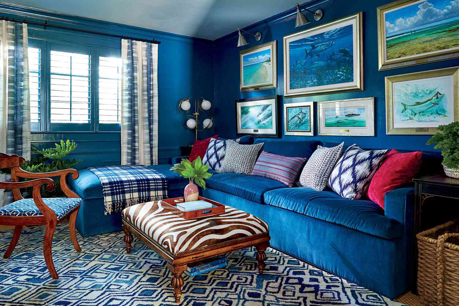
Wells believes that painting trim white, rather than opting for a colorful hue, is the more timeless approach. “My personal theory is that the use of white trim and ceilings will age well and feel more timeless and less trendy when everyone moves on from maximalism to the next trend,” she says. You can still go bold on your actual walls, of course, but keeping the trim subtle will set you up for success down the road.
Painting Your Ceiling A Different Color Than Your Trim
Speaking of trim, be sure to carry that color over onto your ceiling, encourages Jenna Schnabel Wedemeyer, the founder of Schnabel Interiors in Lexington, Kentucky.
“This allows the eye to flow seamlessly up and down,” she says. “If you paint your walls one color, your trim another color, then your ceiling a third color, the eye cannot flow around the room. It creates a broken energy that makes the room less cohesive and appealing.”
Solely Embracing Trends Without Considering Your Space’s Constraints
When it comes to choosing a paint color for your home, stick to your gut.
“Please stop painting a room a certain color based on a trend or what your favorite influencer or designer used,” says Shani Core, the founder of Shani Core Interiors in Palm Beach Gardens, Florida. “A paint color that looks beautiful in one home may look awful in another!”
To make the most informed decision possible prior to committing to a color, Core recommends ordering paint swatches to review at home; she often turns to Samplize, which offers peel and stick paint samples. “You can see how the color actually looks at different times of the day without the mess of real paint,” she shares.


