8 Warm Exterior Paint Colors That’ll Boost Your Home’s Curb Appeal

If you’re getting ready to invest in an exterior paint job or new siding, you want to make sure you make the right color choice the first time—one that’ll make your home look warm and welcoming to anyone who stops by. But choosing the perfect timeless exterior color can be a bit of a challenge. We turned to color experts for tips—and some favorite paint colors to consider.
Exterior Paint Colors for a Warm and Welcoming Home
Dibber by Farrow & Ball
Farrow & Ball
This earthy green hue is one of Patrick O’Donnell’s, global brand ambassador for Farrow & Ball, picks for trim and shutters—especially when paired with a classic white, like School House White. But it also makes a lovely main attraction. “Earth colors will resonate well, whether they be mossy greens, earth reds, or drab browns,” he says.
Swiss Coffee by Benjamin Moore
Benjamin Moore
Warmer whites, like Benjamin Moore’s Swiss Coffee, are a favorite pick of Amy Crane, architectural color consultant at Amy Krane Color. “There’s a historical appropriateness about using white,” she says.
Chestertown Buff by Benjamin Moore
Benjamin Moore
Butter yellow is having a moment, and this creamy, slightly golden hue is the perfect choice for taking a step away from straight-up neutrals. “I adore deep, muted golds on a house,” Krane says. “Benjamin Moore’s Historical Collection is filled with great colors for house exteriors.”
Dimity by Farrow & Ball
Farrow & Ball
This creamy white was O’Donnell’s pick for a recent project. “I recently helped with a house that was a quite austere stone, but the mortar had a lovely soft pink note. We changed the exterior trim from pure white to Dimity, which softened everything and picked up the color of the mortar.”
Knoxville Gray by Benjamin Moore
Benjamin Moore
Move beyond the basic grays with colors that have rich undertones. “Complex grays with hints of blue and green in them, like Benjamin Moore’s Knoxville Gray, are really inviting,” Krane says.
Reduced Green by Farrow & Ball
Farrow & Ball
If you’re ready for a modern, bolder hue, consider this deep green. “A dark weatherboarded home is a thing of great beauty,” O’Donnell says. “Reduced Green would look stunning all over, taking a traditional vernacular into something more urbane.”
Woodstock Tan by Benjamin Moore
Benjamin Moore
If you’re looking for an elevated neutral, Krane recommends Woodstock Tan. “I like colors which straddle color families—colors which seem gold, khaki, green, and brown all at once.”
Tate Olive by Benjamin Moore
Benjamin Moore
Olive greens feel fresh, but are still a neutral color that’ll wear well for years to come. Krane recommends this shade as a terrific exterior paint choice.
Tips for Picking an Exterior Paint Color
Just like when you’re picking interior paint colors, you’ll want to try swatches of the paint on different parts of your home so you can see how they’ll look in different types of light before you commit.
Keep the main color on the neutral side
“No one wants to scare the neighbors with outlandish home exterior colors, but that doesn’t mean you have to ‘follow the crowd,'” says O’Donnell. You can move beyond shades of gray and beige, and opt for earthy hues like mellow greens or rich browns.
And you can’t go wrong with white, no matter the style of your home. “White homes, as long as they’re not stark or cold whites, are so fresh and appropriate for both modern and historical homes, so it seems like a classic choice,” says Krane.
Look toward the warmer hues in your palette
Whites can come in several different temperatures, from the crispest, bluest whites to shades that border on cream. And both Krane and O’Donnell recommend heading to the warmer end of the spectrum for a more welcoming home exterior.
Have some fun with the trim and doors
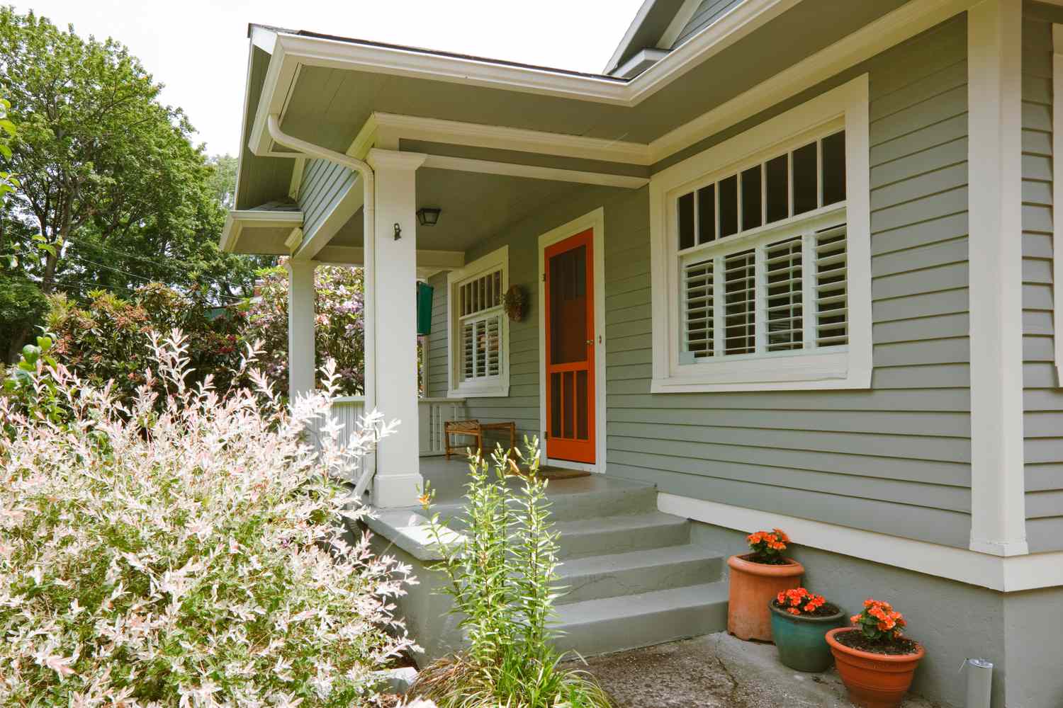
One place where you can introduce a little drama is the trim and doors. O’Donnell recommends going bold. “A color which looks magnificent, but can make people shudder with nervousness, is trim in a bold yellow, especially against a gray or green stone build,” he says. “It enlivens and brings a sense of playfulness.” He recommends Farrow & Ball’s Babouche yellow as an option.
If you want to go in the other direction, you might try a more monochromatic color scheme. “Try matching the trim to the body color,” Krane says. “It’s both modern and historical, creates a really serene, elegant look, and you can still have fun with door and shutter colors.”
Krane also adores a bold-colored door. “Any kind of punchy, fun color for a front door which creates contrast with the body color will invite a warm feeling as long as you choose the color with intention and the knowledge that the color coordinates well with the trim and body colors,” Krane says. “I like muted turquoises, dark teals, deep reds, and mustards, to name a few.”
Consider other architectural details or landscaping when choosing your color
One place to look for inspiration when you’re choosing colors is your home’s surroundings—like the colors your trees turn as the seasons change, or the color of the brick on your chimney or your facade. “If erring towards neutral tones, think of colors that contain elements of the exterior structure or the surrounding environment,” O’Donnell says. He matched the trim colors for one house with the grout on that home’s brick for a cohesive look.