9 Paint Colors That Maximize Natural Light, According to Interior Designers

Natural light is a game changer in any room. It can make your space feel larger, airier, and more relaxing, so it’s best to maximize it when you can. Thankfully, paint colors can do just that—if you’re intentional with your selection.
So how can you find the perfect shade? “When it comes to working with light in a space, it’s important to consider the light reflective value (LRV) of your paint colors,” says Ruth Mottershead, creative director of Little Greene. “Working off this scale will help you choose the right color to create your desired effect.”
Here, we also asked several interior designers to share their go-to paint colors for maximizing natural light. From pretty pastels to versatile neutrals, their recommendations will inspire you to refresh your four walls.
Golden Straw by Benjamin Moore
Pieter Estersohn
Yellow mimics the sun and is an excellent choice for amplifying natural light. “I like to use a lot of yellow; it also brings informality to a room,” says interior designer David Netto. “It bounces light around, even on a cloudy day. No matter what else you put in there—even if there’s just a pop of yellow—you’ll catch that natural light.” Benjamin Moore’s bright, stylish Golden Straw is the perfect way to do just that.
WC-05 by Fine Paints of Europe
Tria Giovan
Another way to make the most of your natural light is by painting the floors as well as the walls. “Any color works as long as it’s shiny, so you’ll want to use Fine Paints of Europe for this, the last of the truly high-gloss paints,” says Netto. WC-05, for example, is a versatile white that lends itself well to this approach.
Sweet Melon by Benjamin Moore
Carmel Brantley
You can’t go wrong with a warm sunset shade, like the vibrant Sweet Melon. “This ripe and juicy coral color picks up all the sunshine coming through the bedroom windows and makes anyone walking through feel as though they’re on a tropical island,” says Mimi McMakin, founder of Kemble Interiors. “It’s also beautiful with candlelight at night and makes a dining room glow.”
Cabbage White by Farrow & Ball
Michael Clifford
There are countless shades of white on the market, but to make the most of your natural light, it’s best to choose one that echoes the natural colors of the sky.
“Cabbage White has a hint of blue that makes it feel bright and crisp, like bringing the sunlight indoors,” says interior designer Zoe Feldman. “In my living room, I leaned into that undertone with soft blue window treatments and an Alex Katz lithograph.”
Alabaster by Benjamin Moore
Ty Cole
A creamier white hue can also help amplify natural light. In this project in Irvine, Calif., interior designer Lara Apelian used Alabaster to enhance the abundant sunlight in the home. “It was the perfect choice. Its subtle warmth keeps it inviting, while its clarity maintains a fresh, open feel,” she says. “The result is an effortlessly serene environment that captures the essence of California living.”
Jaune Trop Cuit by Emery & Cie
Retrouvius, Theo Tennant
Don’t be afraid to take a risk with eye-catching jewel tones. In this project in rural Umbria, interior designer Nicholas Hughes of Retrouvius used a saturated yellow— Jaune Trop Cuit—to take the natural sunlight to the next level.
“It changes depending on the quality of light, from morning to end-of-day light,” he says. “The color choice was inspired by a pair of 19th-century English armchairs, still in their original upholstery.”
Super White by Benjamin Moore
Gieves Anderson
Of course, color drenching with a pure white will always lighten things up. “Super White is the best shade for enhancing natural light,” says Kevan Miller, designer at Apartment 48. “It remains consistently bright all throughout the day. In this space, we used it on the walls, trim, and ceiling.”
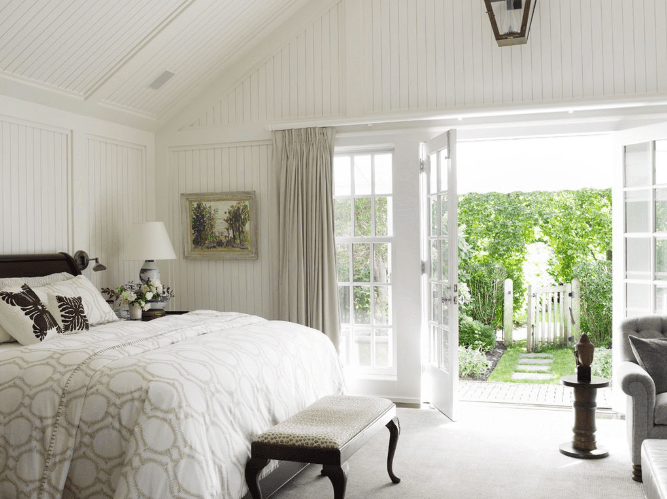
Simply White by Benjamin Moore
Ngoc Minh Ngo
“Simply White is one of our go-to colors to maximize natural light,” says interior designer Young Huh. “The slight yellow undertone catches the sunlight perfectly, and the subtle warm undertones add a touch of interest and sophistication. It’s an extremely versatile color.” Here, the color bathes a bedroom, making the most of the indoor-outdoor space.
All White by Farrow & Ball
Oliver M. Furth
Take brightness to the next level by combining white with pastels. All White, for example, perfectly reflects its neighboring colors. “Here in Southern California, where the sunlight is yellowish, this color appears warm and friendly,” says interior designer Oliver Furth. “I’ve used this color many times, including at my own Los Angeles home, where we painted the walls, ceiling, and floors in this hue.”