6 Tile Colors That Are So Outdated, According to Interior Designers

Choosing the perfect tile color for your project is an important decision. Unlike wall paint or decor choices, tile is a more permanent addition to your home, so the color you choose needs to stand the test of time.
Ultimately, what matters most is whether you love it or not. However, choosing tile colors that are considered modern and stylish can also help increase the value of your home and make it more appealing to potential buyers, which is something you may care about if you plan to sell in the near future.
Regardless of the reason, if you’re looking to avoid tile colors that are considered outdated according to modern design tastes, we’ve got you covered.
We asked three interior designers what tile colors are obsolete, and their answers may surprise you. Read on for the top six tile colors to avoid for a timeless and modern space.
Meet the Expert
- Courtney Batten is the owner and principal designer of Paige Studio, an interior design firm based in Dallas, Texas.
- Alice Moszczynski is a professional interior designer at Planner 5D and a member of the Planner 5D Interior Design Council.
- Daniela Gottschalk is the creative force behind Tinzeltown, a high-concept project development and interior design firm.
Grays
It’s been touted as “Millennial gray” for a reason, and designers tend to agree.
According to Courtney Batten, owner and principal designer of Paige Studio, gray is definitely a tile color to avoid if you’re looking to create a modern and stylish space.
Not only does it feel overdone, thanks to the all-gray-everything trend of the 2010s, but it can also feel cold, sterile, and artificial.
To bring your space into the modern era, Batten suggests opting for tiles in warmer neutral shades such as taupe or light shades of natural beige.
Want more design inspiration? Sign up for our free daily newsletter for the latest decor ideas, designer tips, and more!
Navy Blue
Navy blue is a classic and timeless shade popular in various spaces and contexts throughout the home. From wall paint to decor, this versatile hue adds a touch of calm and serenity to any design. However, when it comes to tiles, Batten says navy blue is a color she avoids.
“As classic as navy blue is, it has been very overdone,” she says. “I’m currently loving deep teals as an alternative that feels a bit more fresh and modern while bringing in a classic pop of color.”
Brown-Beige
Before there was all-white-everything, there was all-beige-everything. Designers agree that beige tile, notably darker brown-beige shades, is sure to make any space feel tired and dated.
“Brown beiges were a big go-to color for hallways in homes built in the late ’90s and early 2000s,” says Alice Moszczynski, interior designer at Planner 5D. “In my opinion, it lacks the energy and brightness we’re after in today’s designs.”
Instead, Moszczynski recommends light taupes or greiges for a more modern alternative. These subtle tones offer the same neutral and earthy appeal without feeling heavy, as brown beiges tend to.
White Marble
This one might come as a surprise, but Batten says that classic white marble tile is on the chopping block for her.
“White marble tile is so tired and overdone,” she says.” As a designer, I try to avoid it at all costs.”
Look around, and you’ll find white marble tile everywhere, from bathroom floors to kitchen backsplashes. While it once read sleek and sophisticated, now it reads cookie-cutter. It’s expected, and that’s the point.
Instead of white marble, Batten recommends trying natural materials like travertine or limestone to bring the look of natural stone to your home in a more modern and fresh way.
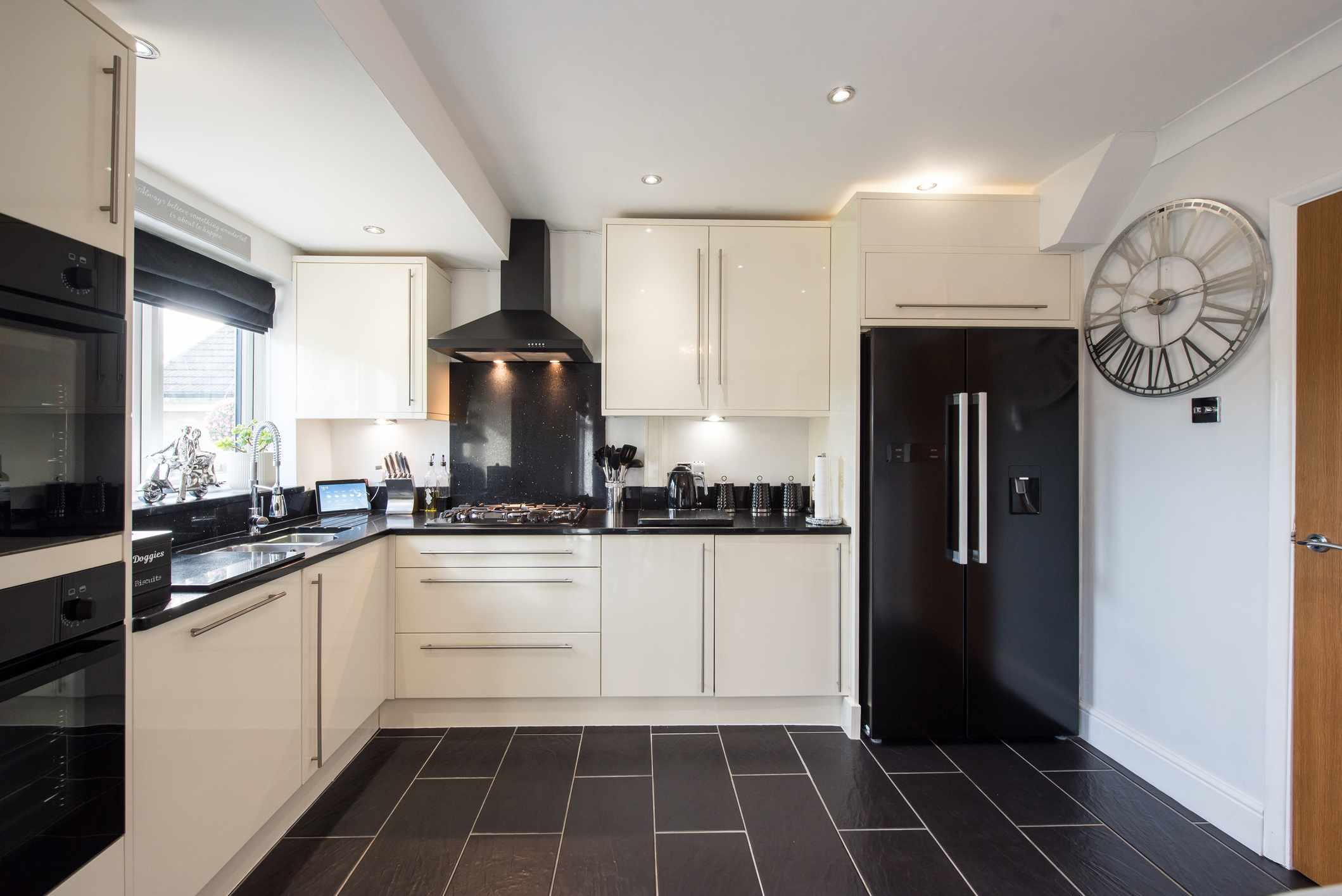
Black
Black is another classic and arguably timeless shade that designers tend to avoid when it comes to tiles. While black will always have its place in interior design, it can feel heavy and too high-contrast when not done right.
“Black, white, and their love child gray are definitely music of the past,” says Daniela Gottschalk, owner and principal designer at Tinzeltown. “Especially when they come in the oh-so-popular metro shape.”
In addition to feeling outdated, black tiles can be impractical for bathrooms and shower or bath stalls, where watermarks and fingerprints can show easily.
However, you don’t need to rule black tile out altogether. Black and white checkered floor tile continues to be a popular choice for interiors of all kinds, particularly kitchens and hallways.
Avocado Green
Lastly, Moszczynski says avocado green is definitely a shade to avoid when picking tile colors.
“Avocado green was once a popular choice for kitchens, especially in the ’70s, but it can feel a bit heavy and nostalgic in a way that doesn’t always work with today’s spaces,” she says.
However, you don’t need to avoid green altogether. Green tile is a popular choice in today’s earth-inspired spaces, but the key is sticking to muted nature-inspired hues.
Moszczynski says she’s partial to soft sage greens or muted olive tones. Deep shades of forest green can also be a great choice if you’re after something a bit darker and moodier.
When in doubt, look to nature and avoid colors that are too saturated or bright (unless that’s what you’re after) if you want to create a space that feels fresh and on par with today’s modern design tastes.