9 Simple Ways to Make Your Small Space Look Layered and Personal (Not Cluttered)

Think living in a small space means you have to limit patterns and accessories for fear of your home looking cluttered? Think again. Take a look at this tiny South Carolina bungalow and see how eclectic art, plenty of patterns, and a consistent color palette amp up how large it lives and its charming looks.
“I had to be very thoughtful about each space—how to incorporate everything I love without overwhelming the eye in a much smaller house,” says homeowner Teresa Roche, who is also an artist, gallery owner, and textile designer. The way she layered art, pattern, and personality into every inch of her home proves that maximalism isn’t off limits even in limited square footage.
Here are 9 small-space decorating lessons from this creative pro.
Set a Color Palette for the Whole House
Brie Williams / Interior Design: Teresa Roche
In a small space, sticking with one neutral wall color throughout all the rooms isn’t boring, it’s strategic. In this house, painting all the walls creamy white (Sherwin-Williams Alabaster) creates a visual flow and sets up a background that allows artwork and patterns to really shine.
Repeating the same accent colors through multiple rooms is another winning strategy in a small space. Roche used a palette of ochers, earthy browns, herbal greens, and warm yellows across every room in her house. In the living room, the palette shows up in upholstered furniture and pillows as well as artwork and the curtains in the adjacent foyer. “The repetition creates an easy flow from one space to the next,” Roche says.
Make Artwork Blend
Brie Williams / Interior Design: Teresa Roche
A gallery wall makes an instant and impactful focal point. In a small space, it’s important that individual art pieces flow together visually and read as cohesive. For her dining alcove, Roche hung favorite pieces from airplane wire, which she attached to a picture rail. The continuity comes from the colors in the artwork and the types of frames. “I love mixing frames of all shapes and sizes, but I stick to subtle materials—white, wood, nickel-brushed silver, and brushed gold—and stay away from black frames because they often overpower the pieces themselves.” The subtle flow from frame to frame keeps the installation from overwhelming the eye.
Use Patterns That Act Like Neutrals
Brie Williams / Interior Design: Teresa Roche
In an open floor plan, be mindful when choosing patterns that will be used prominently. For this kitchen, which is open to the dining and living areas, Roche used an abstract basketweave wallpaper pattern that she considers neutral. (Notice the pattern and color repeat on throw pillows in the adjacent living room.)
“My patterns aren’t crazy patterns—they are classic ones,” she says. “My basketweave pattern was bold enough to make an impression but not too overwhelming for the art I wanted to pair with it,” she says. Other patterns that can act as neutrals include abstract, irregular stripes and plaids. They give a room structure but also fade into the background because of their regular, almost-geometric patterns.
Repeat the Same Pattern
Brie Williams / Interior Design: Teresa Roche
Using the same pattern in both wallpaper and fabric is a longstanding decorator trick for creating a space that looks put together but not overly busy. Roche used the approach in her foyer, hanging wallpaper and doorway curtains in the same painterly stripe. It’s a bold pattern, but because of the white background and the way it’s repeated over so much surface area, the eye registers it as background.
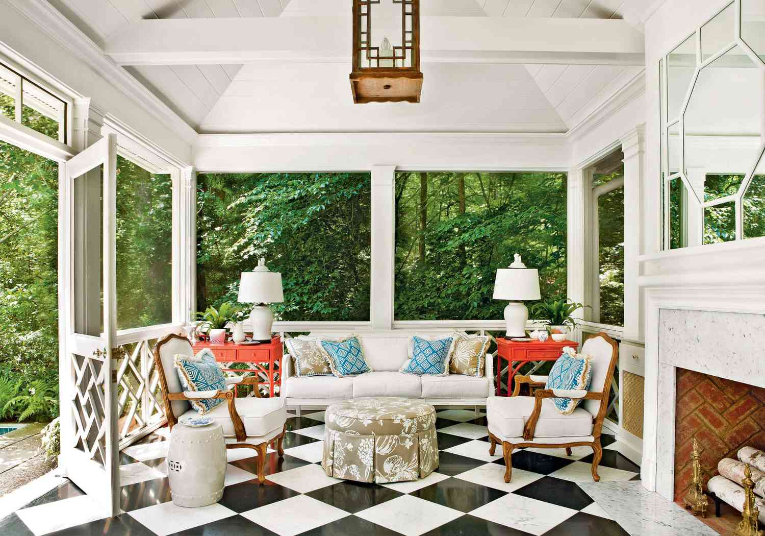
Keep Window Treatments Simple
Brie Williams / Interior Design: Teresa Roche
Heavy, elaborate window treatments can make a small room feel claustrophobic. If you can forgo them altogether, do. In this sitting room, the windows are deliberately bare to let in maximum light and views, plus their white trim blends with the wall color to make the space look larger. If you need the privacy or light control that window treatments bring, choose something simple, such as woven Roman shades or simple white curtain panels, and repeat them throughout the house.
Establish a Furniture Palette
Brie Williams / Interior Design: Teresa Roche
Just like a consistent color palette can make a small space look larger and more well-designed, so too can editing your furniture choices. For example, all of the furniture in Roche’s home shares either similar simple shapes or wood tones, or both. In this house, that means lots of midcentury modern, antique pine pieces, and Danish modern furniture, like this low-slung sofa and chairs, which are so versatile that Roche has reupholstered them three times over the years.
“I never hesitate to mix furniture from various time periods,” she says. “I buy what speaks to me.” When your furniture is cohesive, it’s also easier to move pieces around from room to room when you’re ready for a change.
Think Small Scale
Brie Williams / Interior Design: Teresa Roche
For furniture you only use occasionally, choose a small size that still gives you functionality. For example, using a petite antique pine table, rather than a traditional desk, made it possible to sneak a workstation into the corner of a sunroom.
Maximize Outdoor Space
Brie Williams / Interior Design: Teresa Roche
Because the front porch gets used as an outdoor living room when the weather cooperates, it should be furnished as comfortably as the indoor version. That means ample seating and lighting, which here is accomplished via a simple woven shade. Outdoor chairs in versatile white blend with the house color and railings to make a crisp, uncluttered backdrop for patterned throw pillows.
Draw the Eye Up with Art
Brie Williams / Interior Design: Teresa Roche
Even the stairwell can contribute to a light, bright, and airy feel in a small house when it’s treated to a refreshing white paint job on walls, trim, and the stairs themselves.
Another trick is to hang artwork at the top of the stairs to draw the eyes up and through the space. In her stairway, Roche hung a series of four paintings vertically to emphasize the height of the ceilings. “For stairwells, the negative space becomes as important as the art to me,” she says. “I don’t like cluttered stairwells, so I don’t want to see painting after painting.”
Styled by Jennifer DeCleene