This 1950s Home Trend Never Really Went Away If You Ask Us

We can thank the 1950s for more than a few home trends. Some that lasted or influenced trends today—ranch style homes and checkerboard floors—and others that thankfully did not. (Looking at you, furry toilet seat covers and linoleum floors!) It was the start of the space race, which inspired many atomic and uniquely-shaped light fixtures and wallpapers, as well as the rise of mid-century modern design with clean lines and sleek finishes that we are still familiar with today.
The ‘50s were also a time when people weren’t afraid of using cheerful colors—namely pastels—especially in more functional rooms like kitchens and bathrooms. You’d nary find a white farmhouse kitchen anywhere. Pastel pink, mint green, powder blue, and pale yellow paint and tile aren’t the most statement-making of trends to come out of the era, but they certainly took a backseat during the takeover of wood paneling in the 1970s and resurgence of the all-white kitchen in recent years. If you ask us, they never truly went out of style, but are now making a comeback in a new way.
Getty Images
Jake Fitzjones/Getty Images
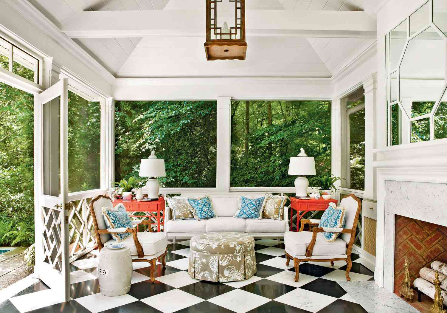
How Pastels Became Popular
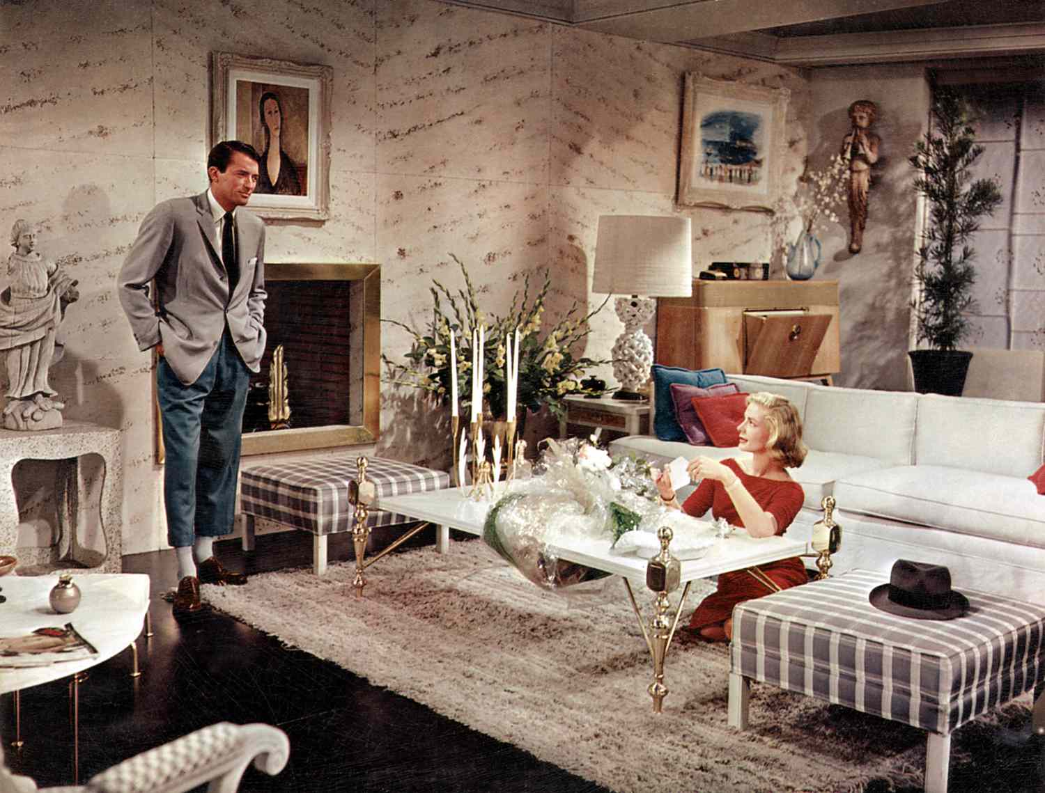
Whether you love them or hate them, the color palette surged during the rise of the midcentury modern look in America’s post-war era. Some might say, the use of pastels was even further popularized by the introduction of colored TV. From floor-to-ceiling powder blue bathrooms to shades of pink used on every aspect of the kitchen—including appliances—these hues made their mark on the decade.
HECTOR MANUEL SANCHEZ; Styling: KATHLEEN VARNER
Why We’ve Always Loved A Pastel
There is certainly merit in decorating a home with longevity in mind, but there’s also something special about infusing everyday spaces with shades you love most. And while we’re all for a statement-making color or pattern, sometimes a softer tone can accomplish the same job without overwhelming the space—especially hardworking ones like kitchens and bathrooms.
We love how you can take one color and vary the hue for various applications of a single room or throughout the home. The pastel palette can easily transition the feel of a space by either serving as the primary or background color.
It’s also a color palette that makes us a little nostalgic and even bled into fashion at the time. “Mamie Eisenhower, First Lady of the United States from 1953 to 1961, embraced a particular shade of pink and frequently used it in her wardrobe and her homes,” says social media director Brennan Long. “While a pink tiled bathroom (with a furry pink toilet seat cover!) might not be for everyone, I appreciate that Mamie leaned into the color she loved.”
Alison Gootee; Styling: Page Mullins
JAMES RANSOM; STYLING: Veronica Olson
How To Use Pastels Today
Homeowners are looking to incorporate more color into their spaces, and it doesn’t always have to be bold. You likely won’t see retro full room takeovers with the bathtub, toilet, sink, and tile all in a bubblegum pink (though we’re not totally opposed if it’s the right application), but we’re advocating for a tone-downed approach to the familiar pastel hue that incorporates the tone in subtler ways.
Pastels are a great way to bring a little more life into the functional spaces of your home whether it’s on the cabinetry, walls, tile, or even with cheeky appliances and hardware. Brands like KitchenAid and Smeg are even re-popularizing colorful kitchen appliances with both small and large products.
And while we’re not playing pastel favorites, if we were to pick one, it would be pink. We’d even venture to say that pastel pinks are replacing warm whites in terms of new neutrals. A subtle pink is not only playful, but can also provide the warmth of sunlight to spaces that don’t naturally get a lot.
Shades We’re Loving
Sherwin-Williams Convivial Yellow, SW-6393
Allie Nott/Color Creative Co. Photography; Design: Amanda Louise Campbell
Farrow & Ball Pink Ground, No. 202
JAMES RANSOM; STYLING: Veronica Olson
Sherwin-Williams’ Corallite, SW 9698
Farrow & Ball Setting Plaster, No. 231
Kate Leichhardt, Courtesy of Amanda Khouri Interiors
Sherwin-Williams Niebla Azul, SW-9137
Photographer: James Ransom; Styling: Christina Wressell
Sherwin-Williams Pink Shadow, SW-0070
Brie Williams Styling: Jennifer Berno Decleene