Interior designers reveal their biggest decorating icks and pet peeves

While getting “the ick” has become pretty ubiquitous in dating conversations, the term goes far beyond romantic relationships – even extending to interior design preferences. At its core, the ick refers to a sudden feeling of disgust or repulsion that’s impossible to shake. From cluttered decor to drab, draining hues, there is an abundance of design details that interiors experts notice – and cringe over – immediately. We’ve asked them to share their unfiltered thoughts, revealing the decorating faux pas that repel them (and what to do instead).
Don’t ‘karate-chop’ your pillows
“I will never karate-chop cushions – it’s a look you often see in photos, where they’ve sliced down the middle with their hand so that the top corners stick up like bunny ears. I think it looks highly contrived. Instead, simply fluff them up and let them be,” says Philippa Thorp, founder and director of London-based design studio Thorp.
Los Angeles-based interior designer Martyn Lawrence Bullard agrees, emphasising: “The karate-chop of a pillow is as dated as wearing Brut aftershave, just more offensive!”
Avoid cluttered decor
“I don’t like decor that feels random and unintentional, making a space look cluttered rather than curated. Take a large coffee table, for example – if it’s covered with random trinkets and mismatched accessories, it loses its sense of purpose and style,” says Sarah Ross, founder of homeware brand, Addison Ross.
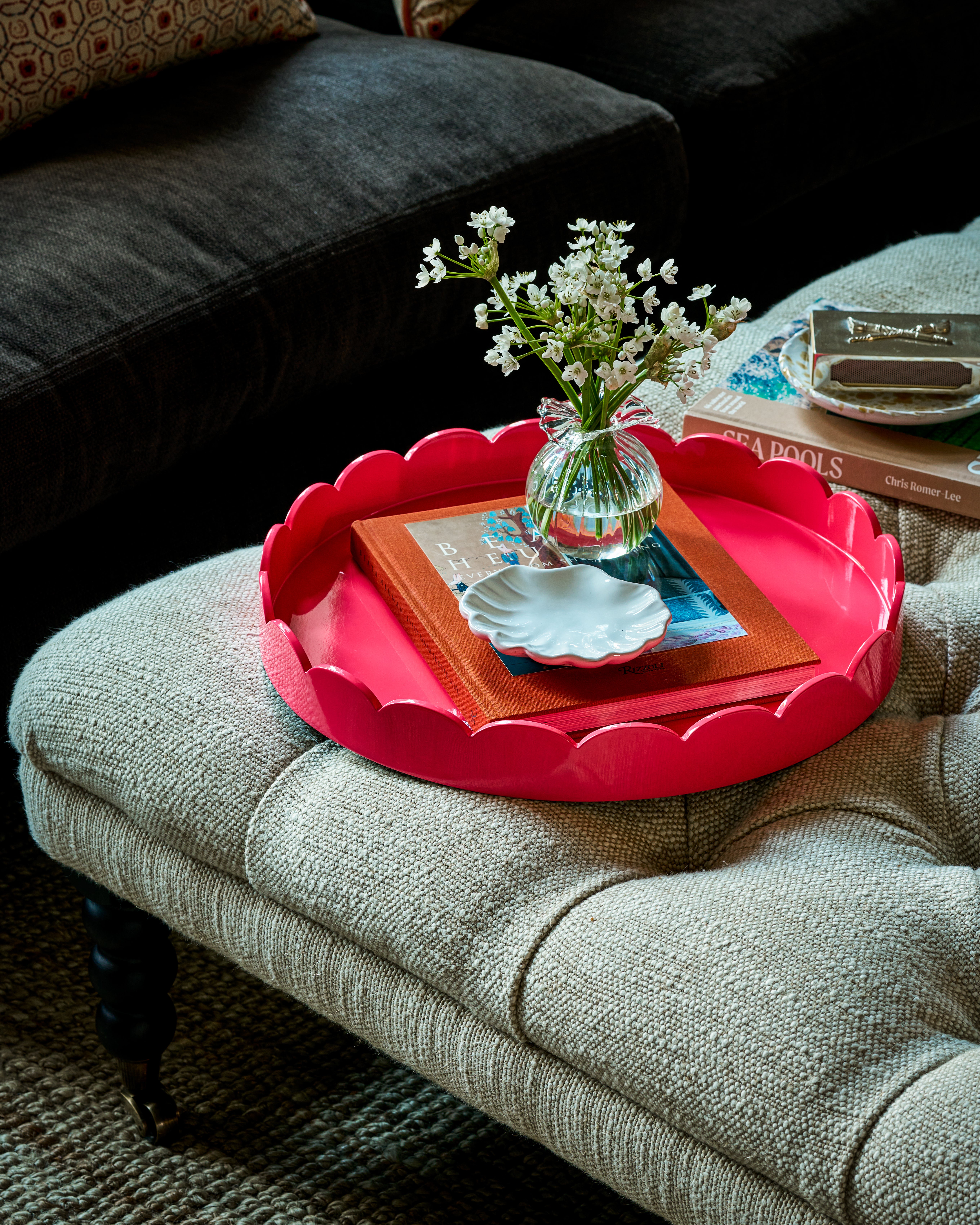
“Instead, try creating an artistic vignette within a glossy lacquered tray. The tray introduces a pop of colour and shine, and provides a refined way to organise your favourite accessories. Try a tall vase of seasonal flowers contrasted with a candle for height variation, and a coffee table book to enhance visual interest. The key is to select each piece thoughtfully, embracing a mix of textures, shapes, and sizes.”
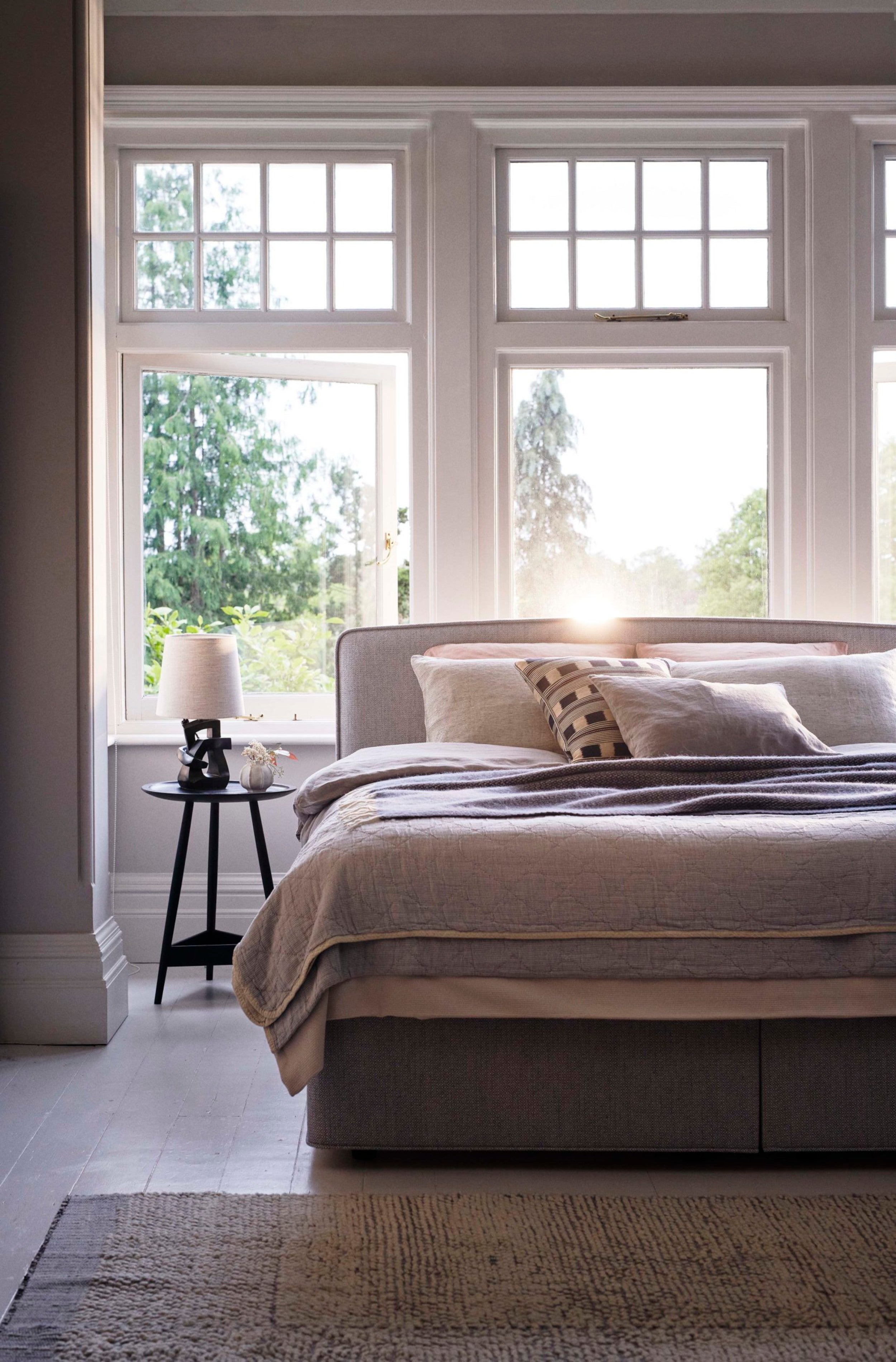
Say no to soulless spaces
“The property development world is still stuck on this awful tone of drab, soul-destroying grey. Avoid cold and draining colours. They may sell properties, making a home appear like a blank canvas – but no one actually wants to live with them. Embrace warmer neutrals instead,” says Philippa Thorp.
Likewise, interior and homeware designer, Laura Hammett, says: “One of my biggest design frustrations is when a space lacks a sense of warmth and layering. A home should feel inviting and lived-in, not like a show home. Too often, I see interiors that are overly minimalist, where everything is stripped back to the point of feeling cold and unwelcoming. The key to timeless design is balance – introducing texture, layering natural materials, and ensuring the lighting isn’t too harsh.”
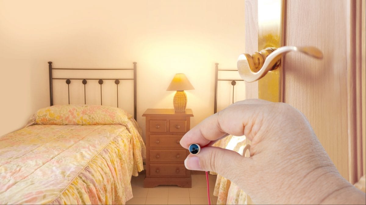
Don’t sacrifice bedroom floor space
“Your bed and mattress should be front of mind when designing a bedroom. Size is imperative and often, we see customers choosing the wrong size for their space,” says Clare Schifano from luxury bed and mattress brand, Vispring. “Generally, you should allow a minimum clearance of 60 centimetres between your bed and the walls to ensure comfortable access, ease of movement for bed making, and to accommodate bedside furniture.” The bottom line: Don’t force a huge bed into a room that’s simply not big enough.
Steer clear of repeating prints
“I absolutely hate the overuse of busy fabrics within a scheme. The same pattern should not be used for curtains, cushions and your headboard – everywhere, on everything. It’s lazy decorating and gets visually tiring,” says Laetitia Thorp, interior designer at Thorp.
“Generally speaking, you shouldn’t use the same fabric multiple times in the same room. It’s much more effective to create layers using differing but complementary colours, patterns, and textures.”
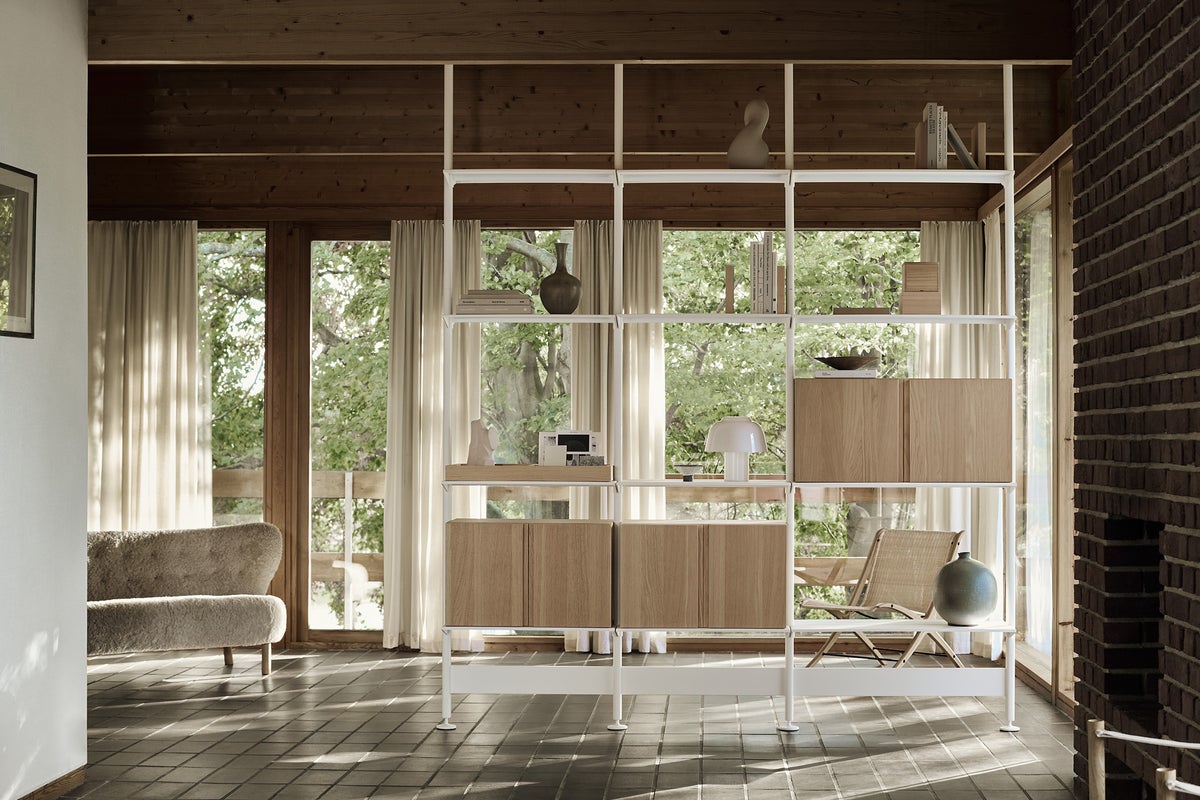
Say goodbye to poorly planned layouts
“One of my biggest pet peeves is a poorly planned layout. A well-designed room should feel cohesive and easy to navigate, with each area serving a clear purpose,” says Bo Hellberg, from Scandinavian modular storage pioneer, String Furniture.
“Floor-to-ceiling shelves are an ideal solution for defining distinct zones within an open-plan room, acting as a stylish room divider. This provides added storage space and creates delineation, whilst still allowing natural light to pass freely through the room.”