
We’re Calling It: Blues And Greens Are The New Neutrals For 2025

When it comes to decorating your home, color is a surefire way to express your individual style. While creams, grays, tans, and browns have long reigned as the old-faithful neutrals, we’re excited to see designers branching out and relying on nature-inspired blues and greens instead. Here are the rules of wielding these happy hues in your own home, according to some of our favorite Southern designers.
Rule 1: Drench in Color
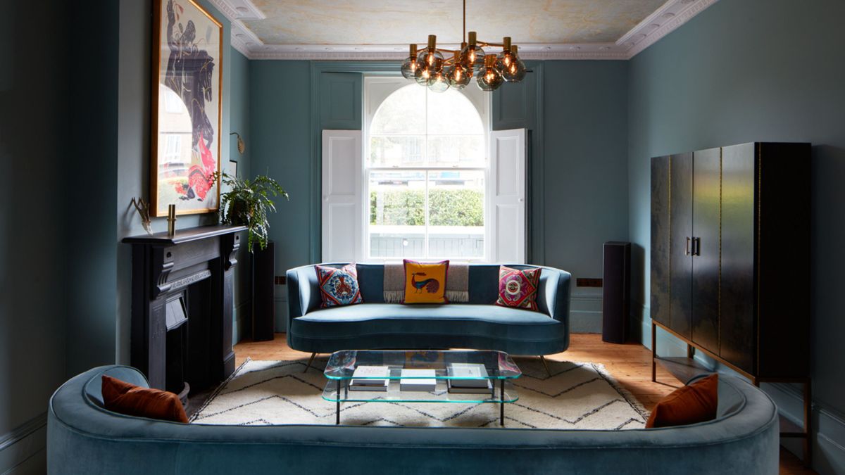
C.W. Newell
Our usual formula is to take the wall color and then dial it up or down on the other items in the room,” says Anna Still of Still Johnson, the design firm she co-owns with Marguerite Johnson in Birmingham, Alabama. “We usually do a darker shade on larger pieces like upholstery and a lighter version on accessories.” They applied the concept to this living room, starting with Sherwin-Williams’ Dark Night (SW 6237) on the walls and trim and extending the hue to a majority of the furnishings throughout—a rich blue velvet sofa with lighter-toned fringe trim, a pair of muted-blue chairs, and hints of the shade in the art and throw pillows. “In the design world, people use the term ‘neutral’ for a color that works with every other color,” says Still. “For us, that’s blue and green. We use them to anchor a room, and then everything else will work with that, no matter what direction we go in.” Adds Johnson, “Blue and green are strong in nature, so in creating home environments, they’re comforting since we are used to being surrounded by them.”
Rule 2: Trim It Out
Markus Wilborn of MW Concepts
“While traditional neutrals (like white, gray, and beige) have long dominated, green and blue offer a fresh take, allowing for more personality while still maintaining a universally familiar feel,” says Atlanta designer DuVäl Reynolds of DuVäl Design, who opts for the two colors to highlight architectural details without overwhelming a room. “Green adds a natural, serene touch, making the space feel grounded without competing with other elements.” He tackled this dining room with a deep olive (Sherwin-Williams’ Rosemary, SW 6187) on the trim, carrying it to the ceiling. “This drenching effect helps create a balance of warmth and sophistication,” he says.
Rule 3: Go Big on Impact
Anna Routh Barzin
“Green as a neutral is one of our favorite ways to layer color but still have a room feel harmonious,” says Charlotte, North Carolina, designer Barrie Benson, who swathed this tree house-like sunroom in Farrow & Ball’s Calke Green (No. 34), which seamlessly blends into the foliage beyond the windows. “Often, when the architecture is right, we will paint an entire room—the walls, trim—all green, which really connects the space to the outside, allowing you to pop in brighter, juicier colors that really pack a punch.” Benson punctuated the cozy spot with red-hued furnishings in a medley of textures and prints.
Rule 4: Play with Contrast (And Textiles!)
Carmel Brantley
For this Old Florida-style farmhouse, designer Lori Deeds of Palm Beach-based Kemble Interiors leaned into an earthy palette that’s not overpowering. “Painting the trim a different color keeps it fun,” says Deeds, who paired Benjamin Moore’s Under the Big Top (1675) with a Schumacher wallpaper (Toile De La Prairie) and a matching table skirt to give a classic look a contemporary spin in this cozy breakfast nook.
Rule 5: Make It Subtle
Jennifer Hughes
For Maryland designer Laura Hodges, a neutral palette is her mainstay, but it certainly doesn’t exclude color. “I think of blues and greens as a way to bring in the outdoors,” she says. “They’re complementary to a lot of environments, especially when you have plenty of natural light coming in.” For this Maryland home surrounded by trees, she adorned the living room walls with a toned-down sky hue (Benjamin Moore’s Silvery Blue, 1647) and then paired that with warmer red and coral accents. “It is very calming, and it feels timeless. I like artwork, decor, and people to have a place to shine,” she says.