Go Ahead, Paint the Trim!

As someone who’s been on a semi-nomadic journey for the past year, I’ve discovered a ton of new decorative interests inspired by every new place I’ve stayed. One such obsession includes any oft-looked opportunities to explore color, particularly when it comes to trim. Sticking to the standard white trim appears to be a given, like having a white toilet, and it’s understandable: It’s classic and safe. There are no concerns of it clashing with the rest of your home and minimal worries about waking up regretting the choice. But where’s the fun in that? To help explore how colorful trim can positively impact a space, we tapped Brooklyn-based designer Delia Kenza of DeliaKenza Interiors for some advice.
Carefully plan your palette
Unless it’s paired with a jazzy wall color, white trims tend to blend in in a sort of unremarkable way. However, Kenza says colorful trim presents an opportunity to “set the stage and jazz up something that’s ordinary and make it extraordinary.” For a colorful trim that acts as a portal to a delightfully character-filled space, Kenza recommends starting with a carefully mapped out palette.
“Maybe you really like blue but there are so many different shades. You want to find the right blue for that setting, then use a paint chart,” Kenza says. In other words, don’t let the battle between cerulean and blue-green derail your project. “If you’re shy about [the color], you can always go up or down three shades.” Go to a hardware store and pick out the swatches that move you the most—and then let the shades on the swatch guide your path.
Trust your color instincts
Try not to get too overwhelmed by the transformational power of paint. Before shying away from that bold purple shade of your dreams, keep in mind that it doesn’t have to be permanent. Go with what resonates and use paint swatches, sticky samples or apply a coat to a tiny spot on the wall to sit with the color before fully committing.
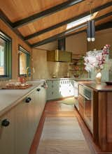
The beams, doors, and trim are in Valspar’s ‘Black Evergreen’ and add some visual interest to a palette of warm woods and natural tones.
“I think a mistake people make is being too bashful,” Kenza says. “Sometimes we tend to overthink things and forget that it’s supposed to be fun and an extension of ourselves. When you have the idea to have the trim stand out, but you don’t just lean into it, it doesn’t really have that impact. Paint is something you can easily switch out with a little bit of elbow grease.”

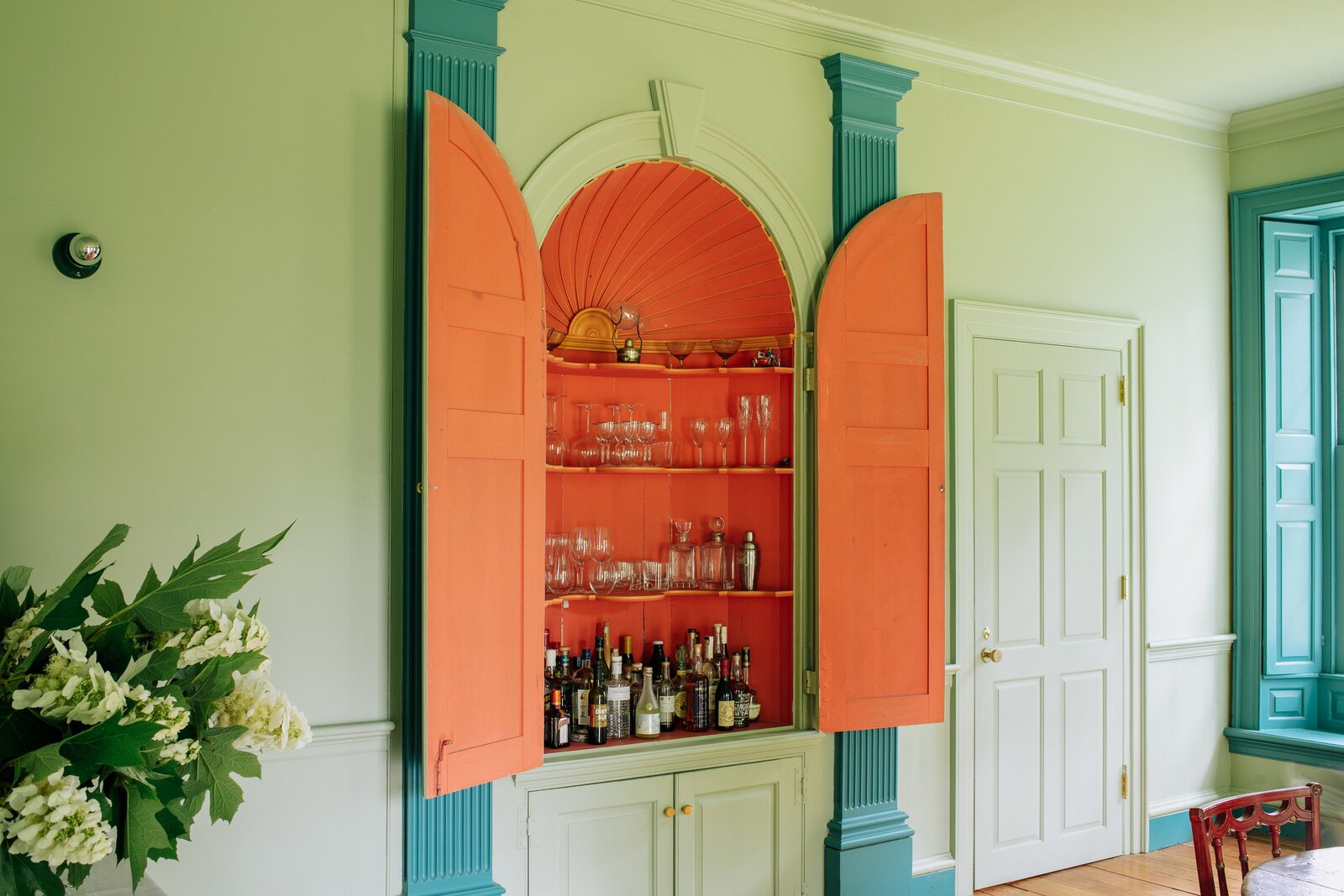
Add some structure and highlight the architecture of your space with just a little paint.
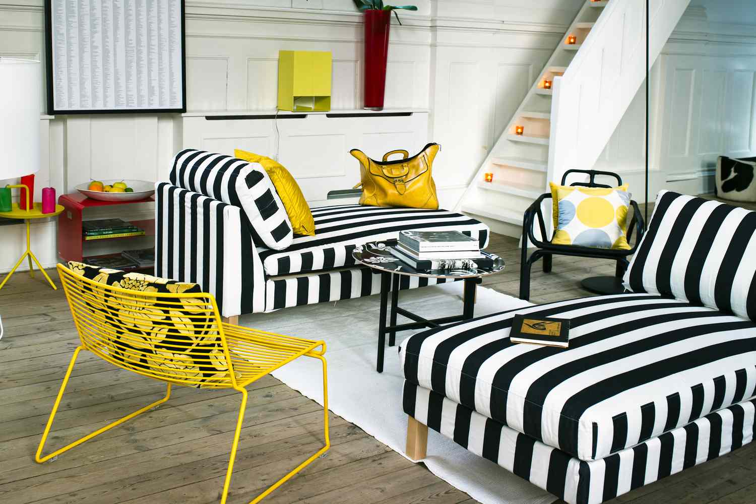
If you’re into a bold look, Kenza’s go-to is sharp, contrasting combos. “I’m really big on black and white. But I also like when it’s very muted—a pale blue with navy blue trim can be very beautiful. Or a pale blue with a brown trim or a black trim.”
Consider the condition of the trim
Make any minor or major repairs on worn trim before settling on a color in order to achieve the best possible outcome. “Think about whether your trim is in nice shape,” Kenza advises. “Some colors will make old trim stand out and you might not want that.”
Don’t forget the finish!
“If you paint the trim a different color, that’s one level, but you can also play with the sheen,” Kenza explains. “That might mean doing a matte on the wall, and maybe satin on the trim. This not only offers contrast on the color, you’re also getting a contrast on the finish.”
Keep the purpose of the room in mind
Painting the trim in a complementary color to the wall whispers rather than shouts.
Bright colors may not be the appropriate choice to frame a moody meditation haven. Or maybe your architectural wellness paint option isn’t the best look for a children’s bedroom threshold transformation. To avoid a color-versus-purpose clash, stick to shades that align with the function of the room your trim will highlight. “Are you trying to make a statement? How do you want to feel in the space?” Kenza asks. “If you go in that direction, you’ll be fine.”
Related Reading: