How to Decorate With Farrow and Ball’s ‘Railings’ — The Secret to Making This Classic Paint Color Work in Your Home

The age-old paint color question: Should I paint my walls a light neutral or something with more saturation and mood? While more color and boldness may be daunting at first, my opinion is that it always pays off in the end. A home office painted in a dark navy? Dark academia is suddenly the aesthetic. A dining room that pairs a deep gray with warm wood? Nothing is more elegant.
The moral of the story is: when you’re looking to create a timeless and elegant atmosphere, don’t settle for a millennial gray or stock black — a more interesting counterpart will always do more for your space. Farrow & Ball’s Railings is among the best paint colors to pursue. In some lights, it could be mistaken for a dark gray, but don’t be fooled, Railings is much more nuanced than that. Hailed as one of Farrow and Ball’s most popular paint colors, Railings comes across as a rich charcoal color with undertones of muted blue making it appear almost navy in some lights.
So, how do you use this color? And where in your interiors is it best suited? I’ve asked a few interior designers who have experience with this color for their best advice.
What Makes Farrow and Ball’s Railings So Popular?
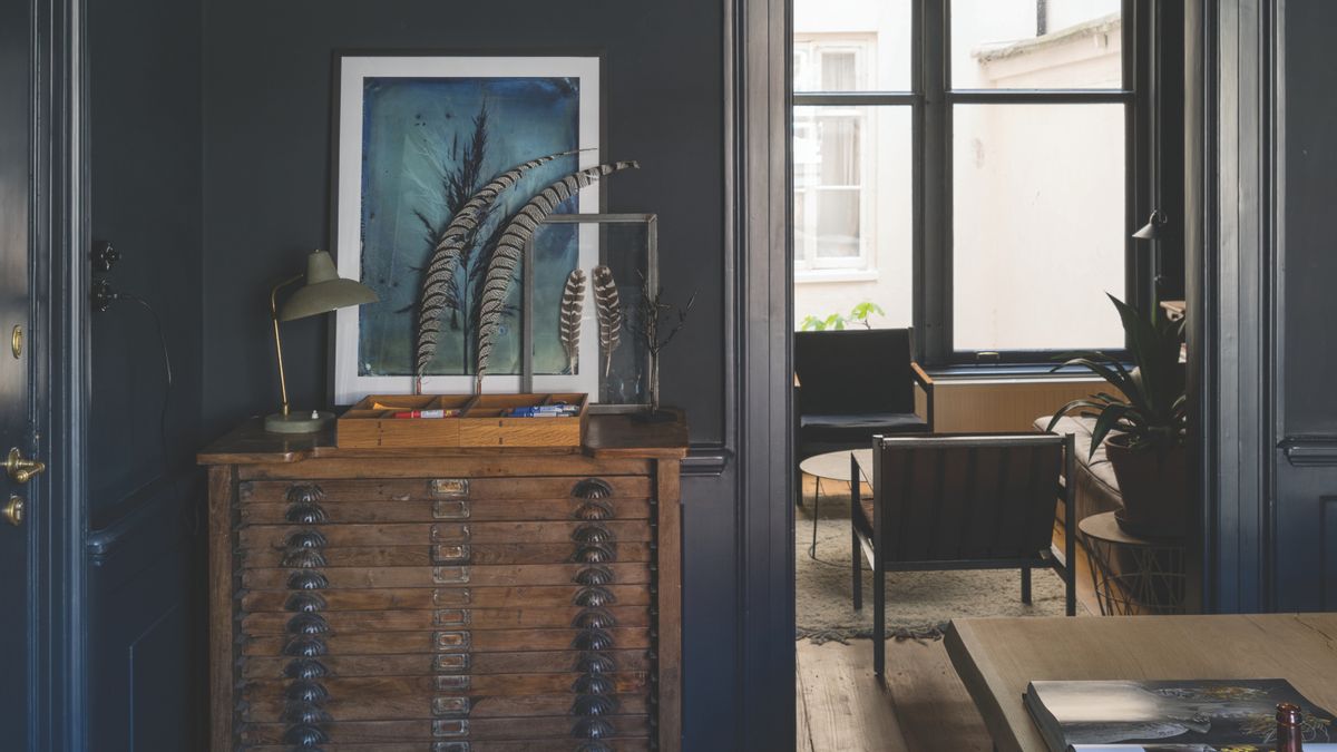
The warm off-white on the walls of the kitchen brings out the warmer gray undertones in Railings rather than the blue. This makes the paint color have a sophisticated, darker feel in the room.
(Image credit: Armac Martin. Design: Rachael Somerville.)
Contemporary design has steered our homes away from dull grays, harsh blacks, and uninspiring neutrals. Neutral and monochrome color palettes have been elevated, adjusted, and refined to align with the modern era of embracing color and creativity. A shade that offers a bit more personality, like Railings, stands out as one of the best black paints to use, as it reveals more than meets the eye.
My biggest question when researching the shade was whether or not it was considered a navy. Interior designer and home renovator, Rachael Peters, explains, “It’s close to black but much softer and has subtle blue undertones which for me make it the perfect shade of Navy.” However, I would argue that the beauty of Railings is its adaptability. Each interior it inhabits affects whether the color leans more blue, gray, or black.
Florida-based interior designer and founder of Laure Nell Interiors, Laetitia Laurent, says, “Railings is one of those colors that surprises people. It looks black at first, but there’s this deep, almost inky blue undertone that gives it a softness. It’s bold, but not in a way that feels stark or heavy.”

Laetitia studied design, art, and history in Paris, and earned her master’s degree in history and international relations from the Sorbonne. Laetitia’s design often leans toward a modern aesthetic as she uses European principles of form and proportion as her guide.

Price: £5.50
Size: 100ml Sample Pot
You can see the charcoal and blue tones in this sample of Railings. It is a lovely alternative to a stock black, gray, or white.
Which Rooms Should You Use Railings in?

This bedroom uses Railings in a color-drenched style creating a cozy, cocoon-like effect.
(Image credit: Farrow & Ball)
Railings’ muted tones grant it more grace than other dark color trends, making it a paint color that easily adapts to any space. Rachael says, “I’ve used it on a kitchen island which was a real feature against the lighter wall units. I’ve also used it on wall paneling in a powder room where I teamed it with a heavily patterned wallpaper to create a dark, dramatic space.” Railings works harmoniously with both minimal and eccentric aesthetics, and it’s a stunning dark color for small rooms.
Laetitia says, “I love it in historic homes because it has that richness that makes architectural details stand out — it feels classic like it’s always been there.” However, in something like a modern living room idea, Railings can add a crisp, sophisticated contrast. Laetitia adds, “I’ve seen it used on walls, cabinetry, trim — it just works.”
“Our perennial favorite, Railings, creates a great backdrop to many a living space,” explains Patrick O’Donnell, color expert and brand ambassador for Farrow & Ball. He says, “Your artwork will register with renewed clarity, you will feel cocooned when bathed in ambient lighting at night and colors will pop against it — think chartreuse yellow or bright emerald sofas in velvet or wool.”
What Colors Go With Railings?

In this kitchen, the contrast of the dark wood floors and soft gray walls gives Railings a more timeless and traditional feel.
(Image credit: Armac Martin. Design: Rachael Somerville.)
As for what colors to use with Railings, Laetitia says, “I’d pair it with warmer neutral paint colors, nothing too bright or stark. Farrow & Ball’s Dimity or White Tie will keep it feeling rich.” And if you want something a little unexpected, “muddy greens or ochres give it that layered, European feel,” says Laetitia.
Aged brass next to it will highlight the luxurious yet traditional feel of the shade and make your space feel curated and considered. How you choose to decorate with Railings will transform the room — it’s all in the details.
Patrick recommends, “For woodwork, either play with the crispness of our purest white, All White or pull out the nuanced blue in Railings by teaming it with a lighter blue color, like Borrowed Light.”

Patrick has been bringing his eye for color and design to Farrow & Ball since 2012. Over that time, he’s worked in showrooms for the brand and people’s homes to transform countless spaces. Patrick has an ISVA Fine Art & Chattels qualification and has studied specialist paint decoration at the Leonard Pardon School.

Price: £5.50
Size: 100ml Sample Pot

Price: £5.50
Size: 100ml Sample Pot

Little Greene
Bombolone™
Price: £5.50
Size: 100ml Sample Pot
There are so many colors that go with black and colors that go with navy blue, and with Railings being a kind-of-black-kind-of-navy shade, it will go with anything. Incorporating a color like this in your home is all about creating drama while keeping the space liveable and cozy. Ready to pull out the paintbrushes?