How to work the colour drenching trend

When it comes to before and after, saturating a space in a single colour brings depth, blurs the lines where walls, ceilings and furniture converge, and creates a sense of flow.
Moreover, it’s such a simple, decorative technique – no need to worry about clashing prints, having to think about scale, proportions of furnishings and making everything visually pleasing – it’s one shade fits all.
A versatile approach, the principal is to paint everything including skirting boards, radiators and window frames, and then build on your theme by incorporating textured elements.
The result? Whether you opt for deep, dramatic tones or soft, uplifting shades, colour drenching transforms interiors into visually stunning, mood-enhancing spaces.
Here’s how to achieve this trending look…
Set the mood
“Colour drenching is a brilliant way to create a space that feels truly cohesive and considered, but the key to having it feel harmonious lies in tapping into colour psychology,” highlights Patricia Gibbons, head of design at Sofa.com.
“Different shades evoke different moods, so think about how you want to feel in the space before committing to a single hue,” advises Gibbons.
Deep blues and rich greens bring a sense of calm and sophistication, perfect for bedrooms or living spaces designed for relaxation, suggests the designer.
“Warm terracottas and muted pinks add a welcoming, cocooning feel, ideal for social spaces. And if you want a burst of energy? Yellows and ochres can bring vibrancy and optimism to a home office or kitchen,” says Gibbons.
“By layering tones within your chosen palette, you can fine-tune the atmosphere and create a space that truly reflects you.”
Drenched Den
Mara Rypacek Miller, founder of Industville, says: “Dens are a great place to apply colour drenching as this look naturally minimises visual distractions – and creates a calming atmosphere.
“When designing a colour-drenched den, it’s important to pay special attention to how light will interact with your chosen colour,” underlines Miller.
“Darker colours naturally absorb light, so the room will need more layered sources of illumination to feel cosy – whereas brighter colours will reflect light so require less.”
Miller also favours grounding colours such as forest green, and says its connection to nature means it offers an innate sense of comfort; and when paired with a carefully layered light scheme, this feeling is amplified.
“Statement light fixtures work particularly well with this look, casting ambient light through intricate, uncontrolled patterns and adding dimension to the space.
“Working with a gloss paint will further enhance this effect,” adds Miller. “Reflecting a warm glow, and fostering a soothing atmosphere that encourages relaxation and wellbeing at home.”
Bathed in beauty
As Helen Shaw, director of marketing (International) at Benjamin Moore, points out: “While there are many ways to colour drench, paint is one of the simplest and most impactful ways to achieve this look.”
Perfectly placed, walls and ceilings provide the ideal canvas and there aren’t any boundaries. Lines are softened, imperfections camouflaged, and the beauty of colour drenching is building on a block of colour; or incorporating several shades of your favourite hue to get the look.
Better still, if you sense brights are too much for your scheme, Shaw says using ‘quietly colourful’ hues like a moody blue will instantly transform a bathroom into a serene, immersive retreat.
“Unlike bold, saturated colours, these ‘in-between’ hues are rich with undertones, creating an immediate sense of ease – and subtly transforming a space throughout the day as light changes,” observes Shaw.
She continues: “Extending the colour drench onto ‘the fifth wall’ (the ceiling) of the bathroom not only enhances the sense of luxury and cohesion, but also blurs edges, creating the illusion of higher ceilings and a grander space.”
Forgotten furniture
There’s no reason to stop at walls when considering a colour-drenched living scheme, says Gisela Lancaster, head of buying at Sofology.
“A tastefully blended sofa in a similar shade makes a big visual impact whilst allowing other interesting design details to take a starring role,” says Lancaster.
The focal point of a living room, she says a sofa with a similar hue and bold design will elevate a space. “Bringing tactile fabrics and sumptuous shapes into focus, with design elements such as curves and fluting enhancing the overall ambience of a room.”
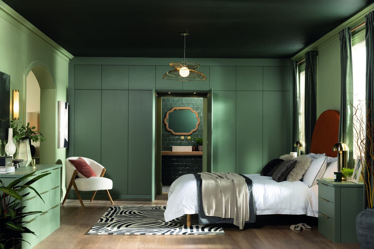
Breathtaking bedrooms
When you’re ready to turn in for the night, taking a colour drenching approach to a bedroom scheme makes a lot of sense, highlights Rachal Hutcheson, national retail manager at Sharps.
“Not only does it maximise space, it helps create a cosy, cocoon-like atmosphere – enveloping you in a soothing environment and ultimately inducing sleep.
“We each spend a good proportion of time looking up whilst resting in a bedroom space, so why ignore the colour of your ceiling?” quips Hutcheson.
She says serene green tones and deep blues offer bold yet timeless options, whilst delivering a design statement that feels truly inviting.
“Choosing an exact colour match for furniture isn’t necessary, with a similar hue providing additional visual interest without losing impact,” adds Hutcheson.