This Legendary Artist’s Work Is Inspiring Fresh Color Combos in Homes, According to TikTok

Looking for fresh color inspiration? TikTokers and beyond are turning to iconic artist and Bauhaus educator Josef Albers to draw interior design inspiration, and specifically color scheme guidance, for their homes. Albers’ lifelong exploration of how colors relate to one another has created a vast body of art, many with unexpected color pairings that can bring new energy to a space. Here’s what design pros say about embracing his stunning color ideas in your own home.
- Margarita Bravo is the founder and CCO of the design studio Margarita Bravo.
- Suzan Wemlinger is the principal interior designer of the interior design studio Suzan J Designs.
- Elle Cantrell is the founder and lead designer of full-service residential design firm Elle Du Monde.
- Nureed Saeed is the owner and creative director of Nu Interiors, a full-service interior design and remodeling project management resource.
Who Is Josef Albers?
Josef Albers was a German-American artist and educator born in Germany in the late 1800s. He became a student of Bauhaus, a school that modernized design in 1920, and five years later he transitioned to being a teacher in the institution. During that time, he met and married fellow Bauhaus artist Anni (Fleischmann) Albers, who would become a world-recognized weaver and textile artist.
When the school closed in 1933, the couple moved to the United States so Josef could teach at Black Mountain College in North Carolina. He was later appointed the head of Yale University’s new Department of Design, a position he held until 1958. He continued his art, becoming the first living artist with a solo retrospective at the Metropolitan Museum in New York in 1971, until he died in 1976.
The Legacy of His Artwork
Much of Josef’s art and teaching explored color. Experimenting with both monochromatic and multi-color works, using everything from glass, to paint and paper, he demonstrated how colors interact and react to one another, as well as how they are influenced by light.
“In order to use color effectively, it is necessary to recognize that color deceives continually,” he wrote on the first page of Interaction of Color.
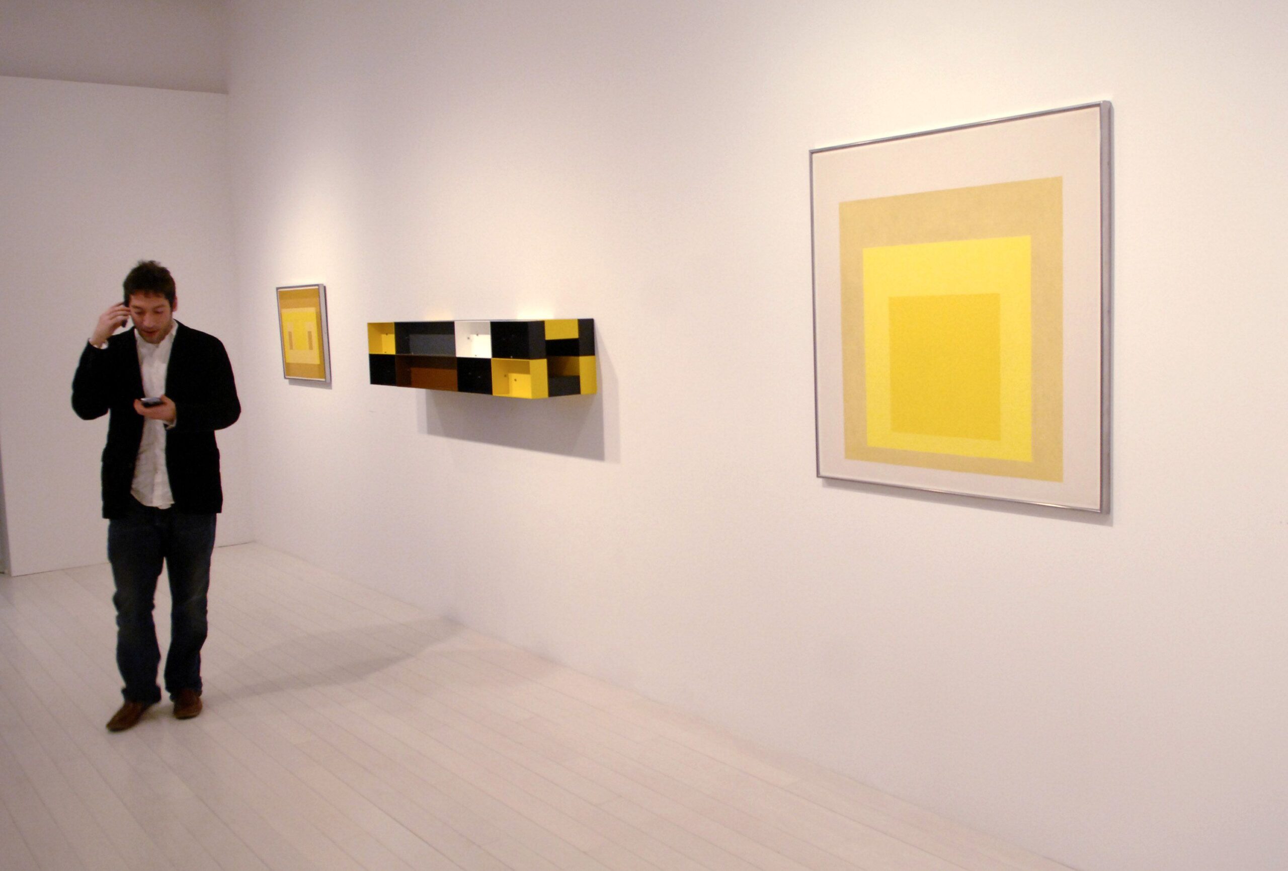
Around the time he transitioned to Yale University, Josef started his renowned Homage to the Square series, using the same geometry (three or four nested squares in each painting) as a foundation to study color. He worked on the series for over 25 years, producing more than 1,000 works, which can be found in museums and cultural institutions around the United States and abroad.
Designer Tips for Using Albers Artwork as Color Inspiration
Josef Albers’ artworks offer an amazing variety of color combinations—a big reason behind the TikTok appeal. But, there’s more to consider than simply finding a palette that resonates with you. We asked design pros how they would approach Albers’ art for interior design and decorating inspiration.
Use His Compositions for Proportions
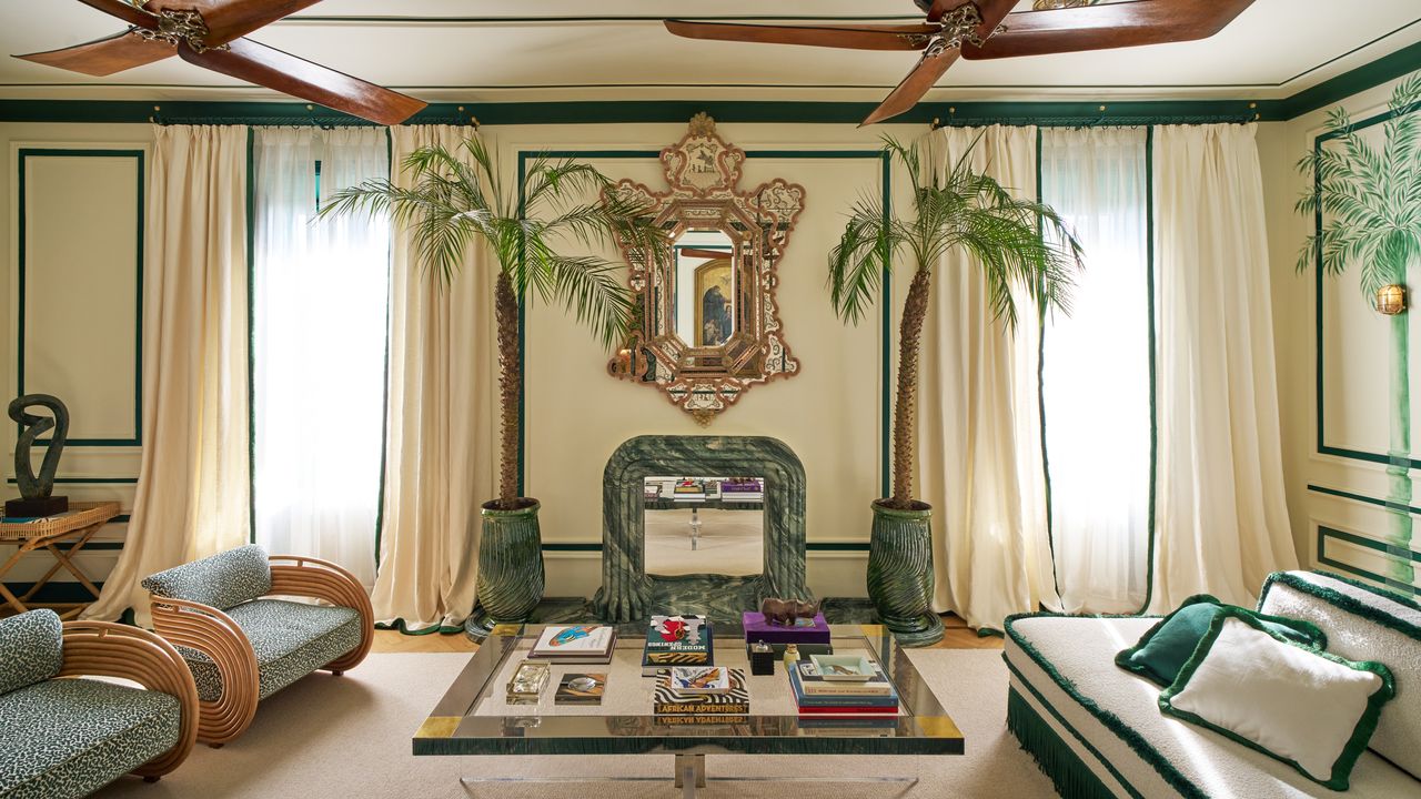
“Josef Albers’ work, such as his iconic Homage to the Square series, is a brilliant study of the power of color relationships—how colors shift, interact, and influence each other depending on their placement,” says design studio Margarita Bravo founder and CCO Margarita Bravo. “These artworks provide a structured yet flexible approach to color layering that translates beautifully into interiors.”
One way to draw inspiration is to use his compositions as a guide for proportion, according to Bravo. She says the 60/30/10 rule is a common guideline in interior design and naturally aligns with how his squares stack. The largest outer square can reflect the dominant wall or upholstery color (60%), the mid-tone middle square can be used for key furniture pieces or millwork (30%), and the smallest inner square makes for perfect accents—think pillows, art, or a bold door color (10%).
Bravo says an alternative approach is to work from the inside out: “Starting with an accent color inspired by the innermost square and then selecting the surrounding hues accordingly,” says Bravo. “This method focuses on a standout shade while ensuring the supporting colors provide depth and cohesion.”
As Albers demonstrated in his studies, light also plays a critical role in how color is experienced and perceived. Before painting, test paint swatches in different lightings.
Tips for Success: “The key to successfully using Albers as a reference is honoring his fearless use of saturation. His colors are never hesitant, and they work because they share intensity,” says Bravo. “If you love an Albers-inspired pairing, go all in—muting or toning it down too much can take away its magic.”
Color as a Starting Point
“I’d start with the color I’m most drawn to, and use that as the jumping-off point,” says Suzan Wemlinger, principal interior designer of the interior design studio Suzan J Designs. Wemlinger suggests color be used on walls, ceilings, and millwork (like color drenching). Next, use fabrics, rugs, window treatments, and painted furniture to incorporate the other colors from the art.
Elle Cantrell, founder and lead designer of full-service residential design firm Elle Du Monde, similarly recommends selecting a dominant color as the grounding feature on a wall or rug. From there, build on the palette by adding other colors through pillows or statement pieces.
Wemlinger offered an example of how she would approach translating Albers’ Variant/Adobe, Gray Turns Violet into a living room. She would color drench the room using a deep eggplant, add a velvet sofa in the lighter green, incorporate a patterned rug using all of these colors, and then add charcoal gray linen drapery panels with patterned multi-color pillows scattered on the sofa. Complementing the hues pulled from the art, she would accent the space by incorporating a caramel-colored leather accent chair, a glass coffee table with a black base, and a black and gold light fixture.
Tips for Success: Wemlinger says to remember that his art is inspiration, and there is no “rule” that says you have to use the exact color shade. The key is making sure colors have similar depths, not that they match completely.
“Monochromatic palettes are the hardest to balance without being overwhelming, so it helps to start with a piece that has a mix of colors as an inspiration,” says Cantrell. She also suggests starting in smaller spaces, like a bar or powder room, if you are new to working with the bold and saturated hues notable in Albers’ art.
Choose Functional Colors
Owner and creative director of Nu Interiors Nureed Saeed has visited Dessau, Germany, and spent time learning about the Bauhaus and its impact, including Albers’ work and legacy.
“It was amazing to see how the study of color was not just about the color inspiration per se, but the idea of color as a functional tool–how it moves you through a space not just emotionally but also practically,” says Saeed. “The idea that a bold color on a ceiling can make a space taller and bring your eye upward, or that color in a space can draw you inward and make the space more productive as a result.”
Tip for Success: “Albers uses colors that complement one another and are in similar saturations or tones, which is important to note. Be careful not to clash or choose paints in different families of saturation,” says Saeed. She also recommends choosing colors that are functional and not just decorative.